- Business Legal
- Business Strategy & Growth
- Social Media Marketing

Recent Posts
6 Tips for Creating Eye-Catching Presentations

Pictures have an incredible power to hold attention. Bold colors, interesting fonts and expressive images bring any presentation to life. In turn, exciting business presentations motivate people to action. They can convince potential customers to make a purchase or show coworkers why your idea is important.
Forget about boring slideshows with dry facts. Our helpful how-to guide for eye-catching presentations can help you turn your next meeting into something incredible. Try these six amazing tips. And when you do consider them, try them out using Intro Maker to create your entertaining and informative slideshows.
1. Choose the Right Images
Pictures can move emotions and tell a story, but only if your audience understands the connection. Select images that are directly related to the topic you’re covering. For example, if you want to show that healthy eating can make people happy, try to find a picture of a group of smiling friends sharing a nutritious meal. Inserting pictures about weight loss or bike riding wouldn’t make sense unless you’re specifically talking about those points.
2. Make Sure Your Content Is Large Enough To See
It’s generally a good idea to shoot for at least HD images, or 1920x1080 pixels, when using slides. If you’re giving a presentation for a large auditorium, and you have a projector compatible with 4K resolution, select images that are 4096x2160 pixels instead. That way even people far in the back can see what’s going on. After all, the pictures aren’t effective if people don’t understand what they’re looking at.
3. Add a Few Incredible PDFs
PDF content can make complex topics much easier to understand. They allow you to take screenshots and modify them with notes, text and other tools. That way your audience can do more than imagine what you’re talking about; they can see the process one step at a time.
- Examples: PDFs are awesome for providing examples. If you’re talking about how to create a great website, take your presentation to the next level by showing PDF examples of incredible websites. You can even underline the content that proves your point.
- Infographics: PDF infographics combine vector images and easy to understand text. These tools are especially helpful for talking about benefits and numbered lists. You can have one vector image for each benefit with a small description, such as “lose weight,” “have more energy,” improve concentration,” and “feel happier.”
- Walkthroughs: With multiple screenshots in PDF format, you can show your audience how to do something. The key is to identify the most important steps and then organize pictures for each one. This is helpful for teaching people how to fill out the online forms, for example.
The key to creating awesome PDF content for your presentations is to select a PDF editor with a lot of tools. We recommend checking out PDF Simpli’s free online PDF editor and JPG to PDF converter. It lets you upload pictures and add text, draw shapes, underline, play around with arrows and combine multiple photos. In fact, you can even add video to your PDFs if you want.
4. Make the Main Points Shine
While pictures are incredible for eye-catching presentations , you need to keep things simple if you want your audience to remember your message. Don’t include something just because you think it looks cool. Instead, select a few main points and choose images that really make them stand out. That way your presentation is clear, powerful and easy to follow.
5. Avoid Unnecessary Pie Charts
Pie charts aren’t as interesting as many businesspeople seem to think. Attention-grabbing statistics that show why an issue is important to your audience can be valuable, but keep these to a minimum. Otherwise you may end up putting people to sleep instead of motivating them.
6. Take Advantage of Color Contrasts
When preparing slides for PowerPoint , smart use of bold color is your friend. One of the most powerful techniques is to use a three-color layout. Choose a monochromatic color scheme for the presentation background , such as lighter and darker shades of blue. Then add a vibrant contrasting color to highlight accent text or images you want people to remember.
How To Go Beyond Your Slides
The best presentations are effective because you give them personality. The right images and colors have a huge impact on your audience, but it’s your passion, humor and excitement that really create a memorable presentation. Use great content as a jumping-off point to get people involved. If possible, throw away your notes and describe images in your own words.
Check Out These Related Posts:

Blog Categories

How-To Geek
7 google slides features for eye-catching presentations.

Your changes have been saved
Email is sent
Email has already been sent
Please verify your email address.
You’ve reached your account maximum for followed topics.
How to Switch From Google to Proton
Chrome is top dog, but firefox is still my favorite browser, why you need a longer password, quick links.
- Apply Image Effects
- Crop an Image to a Shape
- Place Text in Front of an Image
- Shorten Lengthy Videos
- Insert a Chart or Graph
- Position Slide Items With Guides
- Use Subtle Slide Transitions
Assembling a professional slideshow can be intimidating if you don't feel creative or artistic. But that doesn't mean you can't make an appealing and successful presentation. Google Slides provides features to help you design an attractive slideshow.
1. Apply Image Effects
You may have an image or two that could use a little pizzazz. Google Slides offers shadow and reflection features that may give your picture or photo just the right touch.
Related: How to Make an Image Transparent in Google Slides
Select your image and choose "Format Options" in the toolbar. When the sidebar opens, check the box for Drop Shadow or Reflection. Then, expand that section to adjust the transparency , distance, angle, or size.

This lets you take ordinary images up a notch.

2. Crop an Image to a Shape
Another way to make an image stand out is by cropping it to a shape . This is referred to as using a mask in Google Slides.
Select your image and click the Mask Image arrow attached to the Crop Image button in the toolbar. Move to Shapes, Arrows, Callouts, or Equation to see the available shapes in the pop-out menu.

Then simply click the shape you want to use. You'll see your image cropped to fit the shape.

To make additional adjustments to the image, select "Format Options" in the toolbar. You can change the size, rotation, position, brightness, or contrast.
3. Place Text in Front of an Image
For things like a title slide, section divider, or conclusion, you may want a unique look. You can place text in front of (or even behind) an image.
Related: How to Place Images Behind or in Front of Text in Google Slides
With your image and text on the slide, move the text box on top of the image. If the text displays behind the image, select the box and head to the Arrange tab.

Choose Order and pick either "Bring to Front" to place the text box on top of all slide elements or "Bring Forward" to place the text box one level up.

This lets you create a different look or save space, and it works well for welcome, transitional, or wrap-up slides.

4. Shorten Lengthy Videos
If you want to include a video in your slideshow but trim it to only show a certain part of the clip, you can do so right in Google Slides.
Select your video and click "Format Options" in the toolbar. When the sidebar opens, expand Video Playback.

If you have the exact times you want to use, enter those in the Start At and End At boxes. You'll then only see that part of the video when you play it in the presentation.

If you aren't certain of the times, press Play in the preview of the video in the sidebar. When you reach the spot where you want to start the video, pause the playback and click "Use Current Time" below the Start At box. Then, do the same for the end time to the right.

You can then play the video on your slide to make sure you've got the timing correct or adjust it further in the sidebar. Optionally, you can check the box for Mute Audio if needed.
Related: How to Add Videos and Customize Playback in Google Slides
5. Insert a Chart or Graph
Slideshows are all about visuals. So, if you have data you want to present, using a chart or graph is a good way to do it. If you have a chart in Google Sheets you want to use, you can simply insert it. Alternatively, you can create a graph from scratch.
Select the slide where you want the chart. Go to Insert > Chart and choose a chart type to create one or "From Sheets" to import one.

If you make your own graph, you'll see sample data when you insert the chart. Use the arrow on the top right to pick "Open Source."

Google Sheets will open with the sample data in a new tab. Then just add your own data.

Return to the Google Slides tab and update the chart using the Update button. You'll then see your updated visual.

From there, you can do things like resize the chart to add some text or a title or apply a border. For a full tutorial on creating a chart in Google Slides , check out our how-to.
Related: How to Create a Graph in Google Slides
6. Position Slide Items With Guides
To make sure that your images, videos, text, shapes, and other items are placed neatly on the slide, you can use the built-in guides.
Go to View, move to Guides, and pick "Show Guides." You'll see horizontal and vertical lines appear which help you to line up your items perfectly.

To make aligning items to the guides even better, you can add a snap. Head back to View, move to Snap To, and pick "Guides."

Once you enable the second feature, you'll see red horizontal and vertical lines appear as you drag your item on the slide. You can then release the item once it's lined up with those indicators.

For additional details on using guides in Google Slides , take a look at our tutorial.
Related: How to Use Guides to Position Items in Google Slides
7. Use Subtle Slide Transitions
Rather than a sudden jolt from slide to slide, consider using subtle slide transitions. You can apply a fade, dissolve, or other effect for a nicer transition from one slide to the next .
Select a slide to start with; you can easily apply the transition to all slides later. Click "Transition" in the toolbar. When the sidebar opens, expand the section below Slide Transition.
Use the drop-down box to choose an effect. You'll see dissolve, fade, slide, flip, and more.

After you pick an effect, press "Play" at the bottom of the sidebar to see a preview. You can also adjust the speed of the transition using the slider.

To use the transition throughout your presentation, click "Apply to All Slides." When you finish, simply close the sidebar. When you play your slideshow, you'll see that attractive transition between slides.
With tools for sprucing up images , removing unnecessary video content, and replacing data with visuals, consider these Google Slides features for your next presentation.
- Google Slides
Home Blog Business How to Make a Presentation: A Guide for Memorable Presentations
How to Make a Presentation: A Guide for Memorable Presentations

A presentation goes beyond the idea of crafting a catchy document to present in front of an audience. It is an art in which a person relies on communication skills to introduce a topic relevant to a group of people, regardless of its size. Different elements participate in this communication process, such as body language, presentation skills, visual tools, etc. and are key in delivering an effective presentation.
In this article, we shall present a detailed guide on how to make a presentation, intended both for newcomers in this subject but also for professional presenters who seek to improve the performance of their presentations. Let’s get started.
Table of Contents
What is a presentation?
What is a powerpoint presentation.
- The Importance of a good PowerPoint presentation
- Choosing a topic
Consider the audience & presentation goals
Gather data, references, and source.
- Define the storyline
- Define the outline
Using one idea per slide
Choose the presentation format, colors & styles, determine the use of metaphors and visual slides, proofreading and polishing process, prepare your speech, rehearse, rehearse and rehearse.
- How to give a memorable presentation
Start strong
Hook your audience, close your presentation.
- Selecting a PowerPoint template
- Add or delete slides in PowerPoint
- Adding images to slide templates
- Adding notes to your slides
- Adding animations to your slides
- Adding transitions to your slides
- Adding audio narration to your slides
- Ideal typeface and size
Color scheme
Printing your powerpoint presentation, powerpoint presentations tips, closing thoughts.
What is a presentation, and what is a PowerPoint presentation?
It is essential to highlight the difference between Presentation and PowerPoint Presentation, often interchangeable terms. One thing is a presentation, an audiovisual form of communication to present information. A PowerPoint presentation is a subset of a presentation. Since PowerPoint remains the leading tool in the market for creating presentations, the term was coined by both spectators and presenters. Let’s begin by checking the main differences between the two terms.
A presentation is any situation in which a person or group has to transmit a message in front of an audience. The format by which the audience attends can answer the following categories:
- Live crowd: A presentation in which the average number of spectators exceeds 100 people.
- Massive event: Similar to the format above, but we speak about thousands of spectators. This format has specific requirements regarding scenario setup and logistics, and the usual presenters are influencers in worldwide conferences or corporate events (like All-Hands meetings).
- Private event: A selected number of attendants can listen to the presenter. Coaching sessions are the leading kind of private event for presenters, but multiple other categories can fit into this format.
- Online event: Following the trends of remote working and what the pandemic has left us in terms of digital immersion, multiple events shifted their large attendance numbers in favor of online settings. This has the advantage of a narrowed setting, as the area in which the presenter has to stand is considerably reduced – with simpler A/V inputs. Attendees are given a link to the event and watch from their computers or mobile devices.
- Offline event: This medium is what we consume via YouTube videos. Behind each and every YouTube video is countless hours of content development, editing, rehearsing a presentation, and so forth. We call it offline because attendees can browse the content at any time, replaying as desired, unlike Online Events in which the attendees must be logged in to a specific platform. No interaction with the presenter.
- Hybrid event: This is a format coined by large tech companies, the automobile industry, and even fashion brands. The idea is to create an event where a selected number of attendees are allowed to participate (using the Private Event model). Still, at the same time, the event is streamed for users worldwide (Online Event) and/or available on the official social media networks of the brand (Offline Event).
Each one of these formats exposed above has specific requirements in terms of interaction with the audience. For example, in-company presentations will differ from common presentations that seek to capture the interest of new consumers. It is vital to establish the presentation’s intent from the very first moment and then narrow it down according to the topic to present, as well as the knowledge level of your target audience.
A presentation does not necessarily requires to create a slide deck . It is a tool presenters use to make the content more interesting for the audience and also memorable. However, it is well-known that influencer speakers such as Tony Robbins or Warren Buffet ignore PPT documents altogether, preferring to articulate their narrative on the go.
A PowerPoint presentation is a specific type of presentation, which involves the usage of a slide deck crafted with Microsoft PowerPoint. This kind of tool allows presenters to communicate a message through a vast range of mediums, such as images, graphs & charts, audio, and video for a better impact.

Creating a PowerPoint presentation is an easy process, and there are two routes for it: working from a blank slide or using PowerPoint templates .
Some of the advantages of building a PowerPoint presentation:
- Better information retention by the audience, thanks to visual cues.
- Improves the audience’s focus.
- Easy to create powerful graphics.
- Templates are editable, meaning you can repurpose the original designs to meet your standards.
- Saves time to create presentations thanks to its user-friendly UI.
- Encourages teaching and learning processes.
The Importance of a Good PowerPoint presentation
There are some elements that presenters must take into account when making a PowerPoint presentation . It’s not just drag-and-drop, then magic happens. Creating a PowerPoint presentation involves a process of generating the graphic content to display and the narrative around it. The purpose of PowerPoint is to serve as a tool to enhance communication, not to make it overly complex.

We emphasize the relevance of working the speech and graphic content together since the speech itself gives the timeframes for each slide, what elements it contains, or whether it is relevant to use a slide or not to speak about a topic.
Some points to highlight when preparing a presentation:
- Presenters often use the element of surprise. This means a presentation can start without a slide, use a video, or involve a discussion between two parties, then jump to the slide deck presentation. More on this topic later on.
- A good PowerPoint presentation can be your introduction card in multiple professional settings. The effort you put in terms of design and content shall pay back over time in contacts or business deals.
- Having a spare copy of your presentation, preferably in Google Slides presentation format, is a safe-proof technique in case the PPT file gets corrupted. The aesthetic remains the same and can be browsed by any computer with internet access.
How to Make a Presentation (5 Essential Points)
1. planning your presentation.
The first step in making a presentation is to plan the content according to our personal/business goals and the audience’s interest. Let’s break down each part in more detail.
Choosing the topic of your presentation
There are two situations for this. The first one is that you are open to presenting any topic of your preference. This usually happens in business presentations, inspirational presentations, product releases, etc. The second scenario is restricted, by which you have to pick a topic among a selected number of references. That’s the typical situation in which presenters see themselves when taking part in significant events – as not all topics are suitable for the main content of the event, and this is where creativity comes to play.
How to choose a topic, you may ask. Brainstorming is a good technique as long as you remain within the boundaries of this formula:
What you know and feel confident about + What is relevant to the current moment + What can resonate with your audience = Quality Content.
Again, if you experience restrictions due to the nature of an event, but your objective is to share specific information about your business, here are some tactics that can come to play:
- Do keyword research about the topics your business is involved. See the common patterns in your activity compared with the keywords. Then research the 15 articles on the 5 biggest volume keywords. Narrowing the possibilities in your business is a different take.
- Research whether there’s room for sponsored advertisement. That’s an alternative when directly speaking about your business is a no-no in a presentation.
- Turn your presentation into an inspirational story. That works in most events and brings the audience’s interest.
Another vital point to consider is how passionate you can be about the topic of your choice. Nothing speaks more about professionalism than a presenter being deeply involved with the topic in discussion. It sparks curiosity and gives validation as a reliable authority on the content. On the other hand, when a presenter delivers a talk about a topic they don’t connect with, body language usually betrays the presenter. Spectators feel that the speaker wished to be elsewhere, hence dooming the presentation’s performance (and badly impacting the presenter’s reputation).
Consider the purpose of the content to present. Is it going to be informative? Educational? Inspirational? That shall set the tone of your speech later on.
Like with any project, you can estimate the ROI of your presentation with two verifiable metrics: the behavior of the audience and how many contacts did you build after delivering an effective presentation.
Making a presentation has the implicit purpose of helping you construct your network of professional contacts. Even when the presentation has no explicit financial purpose – as in the case of non-profitable organizations, there is still the acknowledgment component. People want to feel validated for the work they do. People want to build long-lasting contacts that can later on turn to be part of a new project.
Considering the audience is imperative, and often one of the pitfalls many presenters fall prey to. You must be aware of the following:
- The knowledgeability of your audience about the topic to discuss. This filters the option of using technical jargon during a presentation.
- The age range and demographics of your audience. It is not the same to discuss a methodology to reduce financial risk to a group of corporate workers in their 40s than to a group of students in their early 20s. The language is different, the intention behind the message is different, and so is the information retention span.
On regards to presentation goals, they can be classified as professional goals (those who seek conversions or valuable business contacts), influential (to establish a brand in the market), educational (to inform a group of people about a topic you researched), etc. Depending on the presentation goals, you can then structure the content to list and the tone in which you speak to your audience.
2. Preparing content for your presentation
No presentation can be made without reference material. Even when you believe you are the most prominent authority about a topic – you have to prove it with valuable, referenceable material. For some niches, this is critical, such as scientific poster presentations, educational presentations, and other areas in which copyright might be an issue.
References for the material you used can be listed in different formats:
- If you are citing a book/article, you can do a bibliography slide, or screenshot the excerpt you want to cite, then include a proper source format below the image.
- You have to credit the author for images/videos that are subject to intellectual property rights. Depending on the context where the image is presented, you may even have to inquire the author about using the image. If the photo in question is yours, no citation is required. Learn more about how to cite pictures in PowerPoint .
- Graphs and charts should include a reference to what they mean, explaining in a short sentence their context. Cite the source if the graph is extracted from a book or article.

As a tip, prepare a document in which you jot down the references used to create the presentation. They can serve whenever a question is asked about your presentation and you must research extra material.
Define the presentation storyline
We interpret the storyline as what is the connecting thread of your presentation. What do you wish to discuss? What motivated you to present this topic in this particular setting and in front of an audience? What can your message deliver in terms of new information and quality to your spectators?
All those questions are worth asking since they shape the narrative you build around your presentation. The storyline is the step before building an actual outline of your presentation.
Define the presentation outline
Now that you have a clear idea of your reference material and the story to tell behind your presentation , it is time to list down your presentation structure in a Table of Contents format. Keep in mind this is for internal reference, as the outline is a tool for writing the speech and creating the slides. You don’t have to list the outline in a presentation; if you desire, you can do a simplistic version with an agenda slide.

Be specific. Don’t let any topic be broad enough to lead to confusion. Sometimes, it is best to list many elements in a presentation outline, then trim them down in a second iteration.
This is perhaps the biggest mistake presenters make in the professional context when creating a new presentation. Slides are free; you don’t have to jam everything in, wishing people get an instant idea about EVERYTHING you will discuss in one slide. Not only does it become overwhelming for the audience, but it is also a faux pas in terms of design: when you use too many elements, the hierarchy does not seem clear enough.
Opt for the “one-idea-per-slide” technique, which, as the term refers, implies using one slide per concept to introduce. Work with as many slides as required, but just one main idea by slide. Your presentation becomes clearer, easy to digest for a non-knowledgeable audience, and also serves as reference material on how to pace your presentation.
3. Designing your presentation
The following section contains guidelines about the different aspects that shape a presentation structure . If you are looking for an all-in-one solution that implements these teachings into presentation design, try SlideModel’s AI Presentation Maker . A time-saver AI-generation tool for presenters powered by Artificial Intelligence.
Event organizers have a saying in the presentation format, which can be online or a live event. Depending on which, users have to structure the elements of their presentation to match the final output. An example of this: it’s not the same to create a PPT slide deck for an event in which you stand on a stage, in front of a live audience, than when you present via Zoom call, using your computer screen to cast the presentation.
The format is different because text usage and images are perceived differently. For starters, an online presentation is most likely to draw users to read the entire content of your slides than a live presentation. The audience may not get your body language in an online presentation, merely watching slide after slide with the presenter’s voiceover. In some conditions, it can be incredibly dull and hard to follow.
Do your research with the event organizers about which format shall be used. When it comes to in-company presentations or educational presentations, the format is usually live, as the audience is selected and part of the same organization (that being a company or a school/university). If a webinar is required for an in-company format, ask the organizers about the length of the presentation, if it is possible to interact with the audience, deliverable requirements, etc.
The aspect ratio for a presentation format usually follows the 16:9 format or 4:3 format. Presentations built in 16:9 aspect ratio are the standard , rectangular format PPT templates, which also serve to be printed without many distortions in regular A4 files. As we work with a rectangular format, there are two axes – horizontal and vertical, in which presenters can arrange the content according to its importance (building a hierarchy). Working with a 4:3 format is more challenging as it resembles a square. Remember, in a square there are no visible tensions, so all areas have the same importance.

As a recommendation, the 4:3 aspect ratio is a safe bet for all projectors & beamers. When working with a 16:9 slide and the projector is 4:3, the content gets squeezed to fit the required ratio, and for that very reason, it is advised to increase the font size if you use a 16:9 slide on a 4:3 projector. Be mindful about logos or photographs getting distorted when this conversion happens.
The 16:9 ratio looks more visually appealing these days as we get used to TVs and mobile devices for browsing content. New projectors are usually intended for 16:9 format, so you won’t experience any inconvenience in this regard.

No, not every color works harmonically with other colors. Colors have a psychology behind their usage and impact, and to not make this guide extensive, we highly recommend you visit our article on color theory for presentations . You can find suggestions about which colors you should use for different kinds of messages to deliver and what each color represents in terms of color psychology.
The color you use in your presentations must be in accordance with your branding. For example: you should definitely not build a presentation with a bright, bold magenta neon tone when your logo contains green neon-like hues. If you work with a PPT presentation template that doesn’t match the color of your branding, we recommend you check our guide on how to change color themes in PowerPoint .
Regarding typefaces, do never use more than 3 different typefaces per design. It is best to stick to 1 or 2 typefaces, using the variations each font offers in terms of weight.
An example of this:
You create the heading title (H1 size) with Open Sans bold. Subtitles should be done in H2 size using Open Sans regular. Body text in paragraph size, using either Open Sans Regular or Light. Words to emphasize shall be bolded for important terms and italics for foreign terms to be explained.

Use a cohesive color scheme that fits the background, graphics (such as charts and bar graphs), text, and even images. It helps the audience to understand concepts more naturally and gives a pleasant experience to the sight.
Just as badly a slide deck filled with text is felt by the audience, the exact impact can be attributed to a slide deck that only contains images. The audience may feel disconnected, not understanding the purpose of the presentation. A second side-effect is when the spectators wish to browse the slides to study, as in the context of an educational presentation. If the presenter does not include any text guidance, the slide deck is a mere collection of images without any reference that helps remember the presentation.
Work in balance, like a 3:1 ratio between graphic elements and text. For every 3 graphic elements, a text box must be included.
Using metaphors in presentations is a great idea to introduce complex topics or to tell a story. Say, you want to make the audience aware of your company’s challenges to reach its current standing in the industry. Using a roadmap template that depicts a mountain is an excellent idea as it reinforces the ideas of “challenge” and “teamwork.”

4. Final touches and polishing your presentation
Before giving any presentation, you should dedicate at least one day to this polishing process. Let’s break down the process for easier understanding.
- Do a first iteration of your slides. The objective here is to grasp how everything looks in terms of design. Check the alignment of images and text, any color inconsistencies, typos, etc.
- Rehearse your presentation one time, tracking how much time it takes to perform the presentation.
- If any information is missing that’s worth adding to the slides, proceed to add it. If there are elements that can be reduced, trim them.
- For time-restricted presentations, get a clear idea about how much time it takes to complete your presentation, plus 5 extra minutes for a Q&A session.
- The second iteration should check the tone of your writing, and double-proof any spelling, punctuation and grammar errors.
After two complete iterations, your presentation is ready to go to the next stage.
Even though we believe the speech is partially built as you prepare your presentation slides, you should dedicate an extra section of time to prepare your speech correctly. This process involves the following steps:
- Identifying the purpose of your presentation. The core element of why you are speaking to this audience.
- Get to know your audience, their interests, their challenges, and what can they possibly wish to overcome.
- Adding value. This is vital – your presentation has to leave a lasting message to your audience on what they are interested.
- A strong start and a strong finish. Don’t neglect any of these elements.
Writing down your speech in notes is a must. It is the tool you can use to rehearse your presentation, and -in case you feel anxious- you can include some speaker notes in your presentation (which won’t be visible to your audience) to help you structure the speech.
Practice makes perfect. Rehearsing does not imply memorizing the entire presentation, as that would make your speech robotic, and prone to errors. How? Imagine a person asking you a question in the middle of your presentation, a question you didn’t expect. A prepared presenter can easily manage the situation because of the background built around the topic. A presenter that memorized a speech and robotically repeated its content can feel unease, losing focus for the remainder of the presentation.
Some valuable tips on the rehearsing process:
- Record your rehearsing sessions. You can use tools like Presenter View in PowerPoint to track your time.
- Make it a memorable event. Creating an engaging presentation requires creativity, so consider brainstorming for new takes on adding exciting elements to your presentation for attention retention.
- An exercise recommended by Tim Ferris is to mimic the conditions as closely as possible. This helps to reduce presentation anxiety, and also to get used to cameras and spotlights or evaluate your body language.
- If possible, ask a friend for feedback on your presentation performance. This is particularly helpful for new presenters to get used to interacting with the audience.
5. Presenting (your presentation)
Now it’s time to talk about the presentation and your performance when delivering it in front of an audience. Giving a presentation has many aspects to discuss, from start to end, the techniques to keep your audience interested in the topic, and also recommendations to make a memorable event. Let’s get started.
How to give a Memorable Presentation – Delivering an Impactful Presentation
There are multiple methods to approach a presentation and deliver an impactful presentation. Let’s be honest, not everyone feels comfortable when standing in front of an audience. For that reason, we want to lay out some fresh ideas to help you bring your best to your spectators.
The first element you ought to be aware of is body language . It has to feel natural, not overly acted but also not stiff. Think of a presentation as a similar scenario in which you have a deep conversation with a group of people about a topic you are passionate about. That mindset helps to ease anxiety out of the equation. Avoid crossing arms or constantly pacing across the stage – that only shows impatience and lack of interest.
Keep the concepts simple. Don’t overload your presentation with unnecessary jargon; if you feel something cannot be easily explained, go break down concept by concept until the whole idea is understandable. Graphics are a fantastic asset to help you in this process and boost your performance as a presenter.
Be mindful of not doing any of these common pitfalls:
- Including large chunks of text on a single slide.
- Using intense background colors that make it difficult to understand the contents of the slide.
- Don’t read every single element in your slides – this is perceived as boring by your audience.
One particularly interesting approach is by Guy Kawasaki, author of the book “The Art of the Start.” He considers the best presentations to be handled using 10 slides, lasting no longer than 20 minutes, and using a 30pt font size. That’s known as the 10-20-30 rule in presentations . It helps you to condense the content for the sake of information clarity.
In case you don’t use a PowerPoint presentation, there are multiple ways to make a presentation memorable:
- Tell a story, but connect with your audience in terms of body language. Play with the elements on the stage (much like TED presenters do), and let the audience feel the experience of your story by being as detailed as possible within the time frame.
- Using a video is an incredibly engaging tool, as it lets you introduce a topic you will discuss in more detail later.
- Use a visual impact in the form of an image with a dramatic element (i.e., climate change consequences, technological advancements, children engaging with technology or studying, etc.). This allows to hook the audience into what’s due to come next.
Knowing how to start a presentation is a critical skill all presenters ought to master. There are several approaches for this behalf, but for the sake of this guide, let’s stick to the following ones.
Using the Link-Back formula
This consists of throwing a story in front of your audience that explains who you are, what your background is, and why your speech should make a difference in the life of the spectators.
The Link-Back formula is beneficial for creating an emotional connection with the audience.
Using a Hook
Asking a rhetorical question, using a powerful fact, or other well-known hook techniques is a plus when starting a presentation. We shall talk about hook techniques for presenters in the next section.
Using a captivating visual
Much like the power of storytelling , visuals impact the audience’s psyche, especially if the presentation is about a trendy topic. Create a quality graphic with any of our designs at SlideModel, a graphic designer’s help, an AI Image Generator, or work with a video.
A hook is a tactic used by presenters as an opening statement but can be used in different areas of the presentation if it has an ample length. Much like the metaphor suggests, they serve to attract the audience to what you are communicating.
Research on attention span during lectures suggests a gradual decline in the audience’s interest in the presentation. That’s exponentially increased if you miss the chance to give a powerful first impression. Check this list of hook techniques to enhance the performance of your presentation skills:
- Asking rhetorical questions – better if a series of them on the topic to discuss.
- Using catchy phrases.
- Using a contrarian position, explain why such thinking harms the topic you wish to introduce.
- Historical event referencing.
- Making a powerful statement, best if data related. (i.e., “Every year, 8 million tons of plastic gets into the ocean, which equals to a truckload being dumped every minute” )
- Using the word “imagine”. It’s one of the powerful words in you can use in presentations .
- Add the comedy element – NB: be careful not to overdo it.
- Apply a “what if” scenario – this hook is similar to the “imagine” but with more data added.
- Tell a story.
- Spark curiosity.
- Smartly use quotations. Do not stick to text-book quotations but give your insight on why the quote is relevant for your speech.
Photo 9: Slide using a hook
Most people assume that ending a presentation equals doing a recap. It is a bad idea since your audience feels as if you haven’t planned a conclusion for your presentation.
Another bad practice is to end with a Q&A format. Although questions and answers are often a required part of any presentation, they shouldn’t be the end of your presentation. You can include questions during your presentation or opt for a proper closure of the presentation past the Q&A session.
There are some powerful strategies to give a memorable ending to a presentation:
- Include a CTA on the lines like “Join our journey!” or similar that make the audience part of a bigger story.
- Close using a relevant quote. The idea is to deliver something that can linger, so the audience remembers your content.
- Use a story to close your presentation, as long as you avoid using a case study. The idea is to close with a meaningful thought, not with boredom.
We recommend you check our article on how to end a presentation for more ideas before reaching this stage of your presentation.
How to Make a PowerPoint Presentation (Quick Steps)
In this section, we will see how to use PowerPoint to make a presentation . Starting from creating a blank presentation or choosing a pre-defined PowerPoint template to preparing the presentation structure by adding PowerPoint slides and then working on the design of the presentation, we will explain how to make a visually-appealing and eye-catching PowerPoint presentation and how to create a slideshow in PowerPoint.
1. Selecting a PowerPoint template
When making a PowerPoint presentation, Professional PowerPoint Templates bring the advantage of not needing to think about complex graphic design decisions. However, there are certain aspects worth considering prior to picking the perfect PowerPoint template.
- Color aesthetic : If your presentation has to be done quickly, stick to PowerPoint templates that resemble your company’s branding palette. Although color can be changed, it is best not to lose time with extra adjustments.
- Opt for minimalistic designs : It is one of the most suitable ways to remain elegant in the professional world. You won’t be signaled for using a template that speaks seriousness on its design – and take for granted everyone shall badly remember the presentation that overdid color or graphics (or even worse, typeface effects).
- Avoid using heavy transition effects : Not all computers are as powerful as the ones you own. The simpler you make your presentation, the best it shall play on any PC.
As in life, there are advantages and disadvantages of using Premium or Free PowerPoint Templates vs. starting from a blank slate.
Advantages of PowerPoint templates when making a presentation
- Speed up the presentation design process.
- Reusable designs, ready for any situation.
- Helps to present data in an understandable format.
- Complex design decisions are made for users.
- Color pairing and font pairing are done for users.
- Helps to reduce the usage of text in slides.
Disadvantages of PowerPoint templates
- We are not learning to use advanced PowerPoint tools, as designs come pre-made for users.
- It can hinder creativity.
- Not every presentation template for PowerPoint is suitable for any topic.
- A professional team of PowerPoint template designers must be behind those templates to ensure quality.
2. Add or delete slides in PowerPoint
When we create PowerPoint Design ideas , not every slide makes the cut for the final presentation. Users then feel overwhelmed about those slides: will they be visible in the final presentation? Should you make a new PPT file without those extra templates? How to clone the “good” slides into a new file?
Instead of worrying about that process, we have here a guide on how to add, delete and rearrange slides in PowerPoint that explains, step by step, how to get rid of the unwanted slides or add more content to your presentation.
3. Adding images to slide templates
Some presentation templates and slide decks include entirely editable placeholder areas, and those boxes do not imply text only – they can include images, graphs, videos, etc. Say you want to add more images to your slides – it is as easy as replicating one of those placeholder areas with CTRL+C / CTRL+V (CMD for Mac users) or going to Insert on the Ribbon’s menu, then Picture .
If you plan to move elements in your slide design, we recommend you get familiarized with how to lock an image in PowerPoint , so the images that shouldn’t be altered remain in position. This technique is ideal when your images are surrounded by plenty of editable graphics.
4. Adding notes to your slides
Presenters often struggle to remember key pieces of information due to performance anxiety or because they were moved from focus by an unexpected question. Using speaker notes in PowerPoint is the answer to prevent becoming stuck, since those notes won’t be available to the viewers – they remain visible only on the computer where the presentation is being streamed.
Keep in mind this technique works when the presenter is sitting next to the computer. If you have to stand in front of a crowd, opt to use different memory-recalling techniques when you feel out of focus.
5. Adding animations to your slides
Another technique presenters use adding animated objects or effects. This is as easy as following these steps:
- Select the object/text you desire to animate.
- Go to Animations in the Ribbon and select Add Animation .
- You can stack animations on a simple object to make unique effects.
Using animated presentation templates is an alternative when you don’t feel confident about adding animations.
6. Adding transitions to your slides
Transitions are animated effects that happen when you change between slides during a presentation. Some people love them, while others prefer to stay away from them.
If you want to add transitions to your slides, follow these steps:
- Select the slide you want to add the transition effect.
- Go to Transitions in the Ribbon, and choose a transition.
- If the transition allows the Effect Options menu, you can alter that transition’s direction and behavior.
- Click on Preview to visualize the effect.
- To remove a transition, select Transitions > None .
7. Adding audio narration to your slides
Sometimes, presenters opt to add audio narrations to the slides. The advantage of using this medium is to increase accessibility for visually impaired users. We created a guide on how to add audio narrations in PowerPoint that explains the procedure in detail.
Considerations for your PowerPoint presentation
Ideal typeface and font size.
There are multiple opinions on which typeface is ideal for presentations. Experience tells us the ideal typeface to work with is one that is system-available, meaning you don’t have to install a new font in the computer used to present. Why? You may ask. Simple: If the font used is not available on a computer, PowerPoint will automatically render a different font (sometimes even a different typeface) to replace and display the text appropriately. That action, which is replicated by other software such as Google Slides, Adobe Photoshop, Adobe Illustrator, Apple Keynote, etc., can drastically change your design.
Font size for titles should be between 36-44 pt. Paragraph font size between 24-28 pt. Use bold to emphasize concepts, and italics to insert foreign terms or quotations. Alternatively, you can make quotations to be displayed on a single slide, using 36 pt size, in italics.
Remember, these recommendations about size are intended for presentations in a live format. If the presentation is streamed through Zoom, using screen sharing, reduce the font size by 10-15% to avoid incredibly large texts. Test your presentation beforehand to be on the safe side.
The color scheme used is a primary part of your presentation design. When defining the presentation color palette , we recommend working within the colors that make part of your branding scheme.
If we speak about a personal presentation or a presentation with no logo, then opt for pastel tones that don’t create harsh contrast between text and background.
Above all things, avoid these conflictive color combinations:
- Yellow and green
- Brown and orange
- Red and green
- Neon colors combined
- Purple and yellow
- Red and purple
- Black and navy
- Navy and red (unless you use a muted red tone or control the amount of red used)
Sometimes, printables are a requirement by event organizers, which represents a challenge to many presenters. We want to give a helping hand on this behalf, offering tips that can improve your printing experience:
- Always work within margins when adding content. It helps not to downsize the presentation, which often renders the text illegible.
- If you have to print a presentation that uses intense background colors, opt for laser printing instead of inkjet. Laser printing won’t make the paper look odd when it is full-color print. The extra price is worth it when presenting a quality product.
- On the same lines about color-heavy presentations, ask for thicker printer paper than the average. This option is often advised when opting for laser printing.
- Run a print proof before ordering a large printing order. Colors can significantly change due to the RGB to CMYK conversion.
In this section, we want to list valuable tips to power up your presentations for their best performance. Some of these tips are tailored to presentation skills, others to design ideas, but ultimately, you can take in mind these tips the next time you need to make a powerful presentation in PowerPoint.
Tip #1. Using Video Presentations
An alternative to conventional presentations is to work with video presentations . These are particularly useful in academic and educational environments since they can convey large chunks of information in a memorable, easy-to-digest format.
If we consider that social media platforms like YouTube and TikTok are transitioning into professional content for creatives, you should consider using video presentations when the situation arises. As a plus, you can repurpose that presentation on your website or other official social media channels for your company.
Tip #2. Drop Shadows and Text Shadows
When we intend to create interesting contrasts between elements, color isn’t the only option to try. Learn how to work with drop shadows in PowerPoint to make images and objects stand out from the presentation. It is an effect that boosts a tri-dimensional feeling in the presentation.
Using text shadows in PowerPoint – with extreme caution – is an excellent method to highlight titles instead of using fancy colors or other 3D effects. Do not overdo the text shadow, as it makes the text illegible.
Tip #3. Working on your Presentation Skills
Giving presentations in front of an audience is, as we have seen, a process that involves many factors. One of those is the human element and the speaker’s ability to resonate with the audience. Therefore, we advise presenters to work on their presentation skills early, especially for mastering different kinds of presentation approaches, such as persuasive presentations (used in sales).
Tip #4. Editing Background Graphics in PowerPoint
Sometimes, PPT presentation templates include quality backgrounds that make the design pop from the screen. Yet, some of those backgrounds may not be suitable for all brands in terms of color, textures, etc.
Learn today how to edit background graphics in PowerPoint and create outstanding presentations in just minutes.
Tip #5. Google Slides compatibility
Finally, we want to remind users that almost every PowerPoint template has compatibility with Google Slides – if you intend to upload the presentation into the Cloud. Google Slides is an online tool for creating slideshow presentations, and one of its features is that we can convert PowerPoint presentations into Google Slides format. The converted slides are entirely editable, allowing presenters to count with a backup plan in case the PPT file doesn’t work or the computer to use doesn’t count with PowerPoint.
This is not an exhaustive list of presentation tips, but they offer a starting point for those who want to create attractive and effective PowerPoint presentations. You can also create presentations in other ways, and leveraging AI, for example. Check out the article how to create a PowerPoint presentation with ChatGPT to learn how to use Large Language Models to prepare presentations.
As we have seen, making a presentation is a complex process involving different skills, from knowing how to deliver a speech to having essential graphic design criteria.
While it is true that PowerPoint presentation templates make the process far more manageable, we shouldn’t entirely rely on them. A PowerPoint presentation isn’t a presentation on its own. It is a medium by which presenters showcase their ideas and structure the speech, but one cannot live without the other.
We hope this guide can give you a better understanding of how to create a successful presentation. See you next time!
Like this article? Please share
Business Presentations, Presentation, Presentation Approaches Filed under Business , Presentation Ideas
Related Articles

Filed under Design • August 14th, 2024
Creating Custom Themes for PowerPoint and Google Slides
Do you want your slides to go beyond the average result from a template? If so, learn how to create custom themes for presentations with this guide.

Filed under Business • August 8th, 2024
How to Create Engaging and Persuasive Proposal Presentations
Secure your business deals and build your brand’s reputation by mastering the art of proposal presentations. Tips and recommended PPT templates included.

Filed under Business • July 24th, 2024
How to Create a Demo Presentation
Discover the secrets behind successful demo presentations and what they should contain with this article. Recommended PPT templates included.
Leave a Reply
Find the images you need to make standout work. If it’s in your head, it’s on our site.
- Images home
- Curated collections
- AI image generator
- Offset images
- Backgrounds/Textures
- Business/Finance
- Sports/Recreation
- Animals/Wildlife
- Beauty/Fashion
- Celebrities
- Food and Drink
- Illustrations/Clip-Art
- Miscellaneous
- Parks/Outdoor
- Buildings/Landmarks
- Healthcare/Medical
- Signs/Symbols
- Transportation
- All categories
- Editorial video
- Shutterstock Select
- Shutterstock Elements
- Health Care
- PremiumBeat
- Templates Home
- Instagram all
- Highlight covers
- Facebook all
- Carousel ads
- Cover photos
- Event covers
- Youtube all
- Channel Art
- Etsy big banner
- Etsy mini banner
- Etsy shop icon
- Pinterest all
- Pinterest pins
- Twitter all
- Twitter Banner
- Infographics
- Zoom backgrounds
- Announcements
- Certificates
- Gift Certificates
- Real Estate Flyer
- Travel Brochures
- Anniversary
- Baby Shower
- Mother’s Day
- Thanksgiving
- All Invitations
- Party invitations
- Wedding invitations
- Book Covers
- Editorial home
- Entertainment
- About Creative Flow
- Create editor
- Content calendar
- Photo editor
- Background remover
- Collage maker
- Resize image
- Color palettes
- Color palette generator
- Image converter
- Contributors
- PremiumBeat blog
- Invitations
- Design Inspiration
- Design Resources
- Design Elements & Principles
- Contributor Support
- Marketing Assets
- Cards and Invitations
- Social Media Designs
- Print Projects
- Organizational Tools
- Case Studies
- Platform Solutions
- Generative AI
- Computer Vision
- Free Downloads
- Create Fund

How to Make a Beautiful PowerPoint Presentation: A Simple Guide
Ready to craft a beautiful and attention-grabbing powerpoint presentation we’ll walk you through slideshow design tips, show you some tricks to maximize your powerpoint skills, and give you everything you need to look really good next time you’re up in front of a crowd..
In this post, we’ll cover:
Key Elements of Winning PowerPoints
Illustrative, not generic, supportive, not distracting, inspiring and engaging, other considerations when creating a slideshow.
How many times have you sat through a poorly designed business presentation that was dull, cluttered, and distracting? Probably way too many. Even though we all loathe a boring presentation, when it comes time to make our own, do we really do any better?
The good news is you don’t have to be a professional designer to make professional presentations. We’ve put together a few simple guidelines you can follow to create a beautifully assembled deck.
We’ll walk you through some slide design tips, show you tricks to maximize your PowerPoint skills, and give you everything you need to look really good next time you’re up in front of a crowd.
And, while PowerPoint remains one of the biggest names in presentation software, many of these design elements and principles work in Google Slides, as well.
Let’s dive right in.
1. Use Layout to Your Advantage
Layout is one of the most powerful visual elements in design, and it’s a simple, effective way to control the flow and visual hierarchy of information. It’s also one of the most important elements to consider when thinking about how to make your PowerPoint look better.
For example, most Western languages read left to right, top to bottom. Knowing this natural reading order, you can direct people’s eyes in a deliberate way to certain key parts of a slide that you want to emphasize.
You can also guide your audience with simple tweaks to the layout. Use text size and alternating fonts or colors to distinguish headlines from body text.
Placement also matters. There are many unorthodox ways to structure a slide, but most audience members will have to take a few beats to organize the information in their head—that’s precious time better spent listening to your delivery and retaining information.
Try to structure your slides more like this:

And not like this:

Layout is one of the trickier PowerPoint design concepts to master, which is why we have these free PowerPoint templates already laid out for you. Use them as a jumping off point for your own presentation, or use them wholesale!
Presentation templates can give you a huge leg up as you start working on your design.
2. No Sentences
This is one of the most critical slide design tips. Slides are simplified, visual notecards that capture and reinforce main ideas, not complete thoughts.
As the speaker, you should be delivering most of the content and information, not putting it all on the slides for everyone to read (and probably ignore). If your audience is reading your presentation instead of listening to you deliver it, your message has lost its effectiveness.
Pare down your core message and use keywords to convey it. Try to avoid complete sentences unless you’re quoting someone or something.
Stick with this:

And avoid this:

3. Follow the 6×6 Rule
One of the cardinal sins of a bad PowerPoint is cramming too many details and ideas on one slide, which makes it difficult for people to retain information. Leaving lots of “white space” on a slide helps people focus on your key points.
Try using the 6×6 rule to keep your content concise and clean looking. The 6×6 rule means a maximum of six bullet points per slide and six words per bullet. In fact, some people even say you should never have more than six words per slide!
Just watch out for “orphans” (when the last word of a sentence/phrase spills over to the next line). This looks cluttered. Either fit it onto one line or add another word to the second line.

Slides should never have this much information:

4. Keep the Colors Simple
Stick to simple light and dark colors and a defined color palette for visual consistency. Exceptionally bright text can cause eye fatigue, so use those colors sparingly. Dark text on a light background or light text on a dark background will work well. Also avoid intense gradients, which can make text hard to read.
If you’re presenting on behalf of your brand, check what your company’s brand guidelines are. Companies often have a primary brand color and a secondary brand color , and it’s a good idea to use them in your presentation to align with your company’s brand identity and style.
If you’re looking for color inspiration for your next presentation, check out our 101 Color Combinations , where you can browse tons of eye-catching color palettes curated by a pro. When you find the one you like, just type the corresponding color code into your presentation formatting tools.
Here are more of our favorite free color palettes for presentations:
- 10 Color Palettes to Nail Your Next Presentation
- 10 Energizing Sports Color Palettes for Branding and Marketing
- 10 Vintage Color Palettes Inspired by the Decades
No matter what color palette or combination you choose, you want to keep the colors of your PowerPoint presentation simple and easy to read, like this:

Stay away from color combinations like this:

5. Use Sans-Serif Fonts
Traditionally, serif fonts (Times New Roman, Garamond, Bookman) are best for printed pages, and sans-serif fonts (Helvetica, Tahoma, Verdana) are easier to read on screens.
These are always safe choices, but if you’d like to add some more typographic personality , try exploring our roundup of the internet’s best free fonts . You’ll find everything from classic serifs and sans serifs to sophisticated modern fonts and splashy display fonts. Just keep legibility top of mind when you’re making your pick.
Try to stick with one font, or choose two at the most. Fonts have very different personalities and emotional impacts, so make sure your font matches the tone, purpose, and content of your presentation.

6. Stick to 30pt Font or Larger
Many experts agree that your font size for a PowerPoint presentation should be at least 30pt. Sticking to this guideline ensures your text is readable. It also forces you, due to space limitations, to explain your message efficiently and include only the most important points. .

7. Avoid Overstyling the Text
Three of the easiest and most effective ways to draw attention to text are:
- A change in color
Our eyes are naturally drawn to things that stand out, but use these changes sparingly. Overstyling can make the slide look busy and distracting.

8. Choose the Right Images
The images you choose for your presentation are perhaps as important as the message. You want images that not only support the message, but also elevate it—a rare accomplishment in the often dry world of PowerPoint.
But, what is the right image? We’ll be honest. There’s no direct answer to this conceptual, almost mystical subject, but we can break down some strategies for approaching image selection that will help you curate your next presentation.
The ideal presentation images are:
- Inspirational

These may seem like vague qualities, but the general idea is to go beyond the literal. Think about the symbols in an image and the story they tell. Think about the colors and composition in an image and the distinct mood they set for your presentation.
With this approach, you can get creative in your hunt for relatable, authentic, and inspirational images. Here are some more handy guidelines for choosing great images.
Tips on Making Beautiful PowerPoint Presentations
So, the slide in question is about collaborating as a team. Naturally, you look for images of people meeting in a boardroom, right?
While it’s perfectly fine to go super literal, sometimes these images fall flat—what’s literal doesn’t necessarily connect to your audience emotionally. Will they really respond to generic images of people who aren’t them meeting in a boardroom?
In the absence of a photo of your actual team—or any other image that directly illustrates the subject at hand—look for images of convincing realism and humanity that capture the idea of your message.
Doing so connects with viewers, allowing them to connect with your message. This is one way to learn how to make your PowerPoint stand out and ensure a dynamic presentation PowerPoint.

The image above can be interpreted in many ways. But, when we apply it to slide layout ideas about collaboration, the meaning is clear.
It doesn’t hurt that there’s a nice setting and good photography, to boot.
Now that we’ve told you to get creative with your image selection, the next lesson is to rein that in. While there are infinite choices of imagery out there, there’s a limit to what makes sense in your presentation.
Let’s say you’re giving an IT presentation to new employees. You might think that image of two dogs snuggling by a fire is relatable, authentic, and inspirational, but does it really say “data management” to your audience?
To find the best supporting images, try searching terms on the periphery of your actual message. You’ll find images that complement your message rather than distract from it.
In the IT presentation example, instead of “data connections” or another literal term, try the closely related “traffic” or “connectivity.” This will bring up images outside of tech, but relative to the idea of how things move.

There’s a widespread misconception that business presentations are just about delivering information. Well, they’re not. In fact, a great presentation is inspirational. We don’t mean that your audience should be itching to paint a masterpiece when they’re done. In this case, inspiration is about engagement.
Is your audience asking themselves questions? Are they coming up with new ideas? Are they remembering key information to tap into later? You’ll drive a lot of this engagement with your actual delivery, but unexpected images can play a role, as well.
When you use more abstract or aspirational images, your audience will have room to make their own connections. This not only means they’re paying attention, but they’re also engaging with and retaining your message.
To find the right abstract or unconventional imagery, search terms related to the tone of the presentation. This may include images with different perspectives like overhead shots and aerials, long exposures taken over a period of time, nature photos , colorful markets , and so on.

The big idea here is akin to including an image of your adorable dog making a goofy face at the end of an earnings meeting. It leaves an audience with a good, human feeling after you just packed their brains with data.
Use that concept of pleasant surprise when you’re selecting images for your presentation.

Setting Appropriate Image Resolution in PowerPoint
Want to learn how to make a PowerPoint look good? Though you can drag-and-drop images into PowerPoint, you can control the resolution displayed within the file.
All of your PowerPoint slide layout ideas should get the same treatment to be equal in size.
Simply click File > Compress Pictures in the main application menu.

If your presentation file is big and will only be viewed online, you can take it down to On-screen , then check the Apply to: All pictures in this file , and rest assured the quality will be uniform.

This resolution is probably fine for proofing over email, but too low for your presentation layout ideas. For higher res in printed form, try the Print setting, which at 220 PPI is extremely good quality.
For large-screens such as projection, use the HD setting, since enlarging to that scale will show any deficiencies in resolution. Low resolution can not only distract from the message, but it looks low-quality and that reflects on the presenter.
If size is no issue for you, use High Fidelity (maximum PPI), and only reduce if the file size gives your computer problems.

The image quality really begins when you add the images to the presentation file. Use the highest quality images you can, then let PowerPoint scale the resolution down for you, reducing the excess when set to HD or lower.
Resizing, Editing, and Adding Effects to Images in PowerPoint
PowerPoint comes with an arsenal of tools to work with your images. When a picture is selected, the confusingly named Picture Format menu is activated in the top menu bar, and Format Picture is opened on the right side of the app window.

In the Format Picture menu (on the right) are four sections, and each of these sections expand to show their options by clicking the arrows by the name:
- Fill & Line (paint bucket icon): Contains options for the box’s colors, patterns, gradients, and background fills, along with options for its outline.
- Effects (pentagon icon): Contains Shadow, Reflection, Glow, Soft Edges, 3-D Format and Rotation, and Artistic Effects.
- Size & Properties (dimensional icon): Size, Position, and Text Box allow you to control the physical size and placement of the picture or text boxes.
- Picture (mountain icon): Picture Corrections, Colors, and Transparency give you control over how the image looks. Under Crop, you can change the size of the box containing the picture, instead of the entire picture itself as in Size & Properties above.
The menu at the top is more expansive, containing menu presets for Corrections, Color, Effects, Animation, and a lot more. This section is where you can crop more precisely than just choosing the dimensions from the Picture pane on the right.
Cropping Images in PowerPoint
The simple way to crop an image is to use the Picture pane under the Format Picture menu on the right side of the window. Use the Picture Position controls to move the picture inside its box, or use the Crop position controls to manipulate the box’s dimensions.

To exert more advanced control, or use special shapes, select the picture you want to crop, then click the Picture Format in the top menu to activate it.

Hit the Crop button, then use the controls on the picture’s box to size by eye. Or, click the arrow to show more options, including changing the shape of the box (for more creative looks) and using preset aspect ratios for a more uniform presentation of images.

The next time you design a PowerPoint presentation, remember that simplicity is key and less is more. By adopting these simple slide design tips, you’ll deliver a clear, powerful visual message to your audience.
If you want to go with a PowerPoint alternative instead, you can use Shutterstock Create to easily craft convincing, engaging, and informative presentations.
With many presentation template designs, you’ll be sure to find something that is a perfect fit for your next corporate presentation. You can download your designs as a .pdf file and import them into both PowerPoint and Google Slides presentation decks.
PowerPoint Presentations FAQs
What is the 5 5 5 rule in powerpoint.
The 5 5 5 rule in PowerPoint is fairly simple: 5 lines per slide, each line with no more than 5 words, and make sure your presentation is no longer than 5 minutes.
How long should your PowerPoint be?
A PowerPoint can be as long as it needs to be, but some people—and the 5 5 5 rule—advise you to keep five minutes or shorter.
What is the easiest way to make a PowerPoint prettier?
Beyond using eye-catching imagery and colors, a pretty PowerPoint should also follow good design principles. You want the information to be organized, balanced, and easy to digest. It doesn’t matter how many appealing images you include are if the information is hard to internalize. Use appropriate fonts and shorts sentences to make sure the words are legible and don’t crowd the slides with too many elements.
License this cover image via F8 studio and Ryan DeBerardinis .
Recently viewed
Related Posts

Light Painting Photography Ideas: Easy Tips to Get Started
Light painting photography is a type of long exposure photography…

What Is the Bokeh Effect and How to Achieve It in Photos
Ethereal and dreamlike, the bokeh effect is a specific photographic…

How to Use Color Saturation to Enhance Your Photos
Color saturation refers to the intensity of color in an…

11 Profile Picture Ideas to Stand Out on Any Platform
While social media is designed to be fun and casual,…
© 2023 Shutterstock Inc. All rights reserved.
- Terms of use
- License agreement
- Privacy policy
- Social media guidelines
Slides and Presentations
Presentations are a great way to communicate and show a certain topic to your audience. With Infogram you can design eye-catching slides that captivate attention and engage people right from the start. Explore our impressive portfolio of examples for inspiration.
- Infographics
- Social media graphics
- Instagram posts
- Facebook posts
- LinkedIn posts
- Twitter posts
- Pinterest posts
- Email headers
- YouTube thumbnails
- Column & Line
- Facts and Figures

Slides are ways of communicating ideas and information to your audience. Depending on the subject, the best and most effective presentations will consist of 10 to 12 slides to get your idea across. In the case of more complex topics, you might need more slides to communicate your message.
Start with an eye-catching presentation template with visually appealing slides examples to help you capture people's attention and engage them in your topic from the get-go - no matter how difficult the message.
What makes good slides
If you want your presentation to make sense to your audience, it needs to contain several important elements.
First, you need to have good content. Collect all the information that's necessary to clarify the topic. Just don't go overboard with the amount of information - there's a limit to how much content the audience can absorb.
This brings us to the second important aspect - the structure of your slides. Your presentation must be sequenced and paced. It should also have a logical beginning, middle, and end.
Last, but not least - the packaging. Your presentation must be well prepared, and your slides should be organized. Remember to use high-quality graphics and a visual theme to keep a unified style.
Get started with Infogram
This is where Infogram steps in as the go-to tool for creating powerful slides. With our one-stop slides maker, you can easily build a powerful presentation while keeping it simple and accessible.
Add infographics, pictures, text, and other elements. Customize your presentation to fit your tone of voice. To save time, reuse slides examples from presentations you've created previously. Browse our impressive portfolio of presentation slides examples for inspiration and start creating.
All rights reserved © 2024 Infogram. Terms & Privacy Infogram and Infogr.am are registered trademarks of Prezi, Inc.

- Single chart
Presentation Training Institute
A division of bold new directions training, design tips for an eye-catching presentation.
Presentation slideshows often get a bad rap and for good reason. All too often, presenters throw tons of data onto slides and read it verbatim to their audience. These long-winded speakers and terrible slides completely undermine the point of using visuals in a presentation. Visual aids can be a fantastic way to enhance your presentation, make it easier for audiences to follow along, and to make your presentation more memorable. That’s IF they are designed properly. The images you should can greatly impact your presentation, either adding to or detracting from your overall message. Whether you are using PowerPoint, KeyNote, or any other presentation software, these tips will help you design a visual presentation that will capture audience attention while effectively getting your point across.Â
Avoid Stock Templates
Sure, it may be convenient to use those stock templates that are included in your presentation software, but that’s also a surefire way to bore your audience. They have seen those same stock templates over and over and there is nothing memorable about them. Instead, create a clean presentation starting from scratch. Use simple fonts, colors, and backgrounds for a unique and streamlined presentation.Â
Keep Text to a Minimum
Overloading your presentation slides with too much text is a common mistake. The audience does not want to read paragraphs of information, as that is way too much to process. Chances are, they will take one look at all that text and immediately tune you out. A good rule of thumb is to have no more than 6 lines of text in any given slide. Avoid complete sentences and keep text clear, simple, and to the point. Remember that the text on the slide is only meant to enhance or reiterate what you are speaking.Â
Use the Right Font and Size
When it comes to choosing a font for your presentation, always choose legibility over fun. All of these fancy scripts and funky texts are way too hard for audiences to read. Instead, stick with clean, traditional fonts that are easy to read. Likewise, make sure your font is the appropriate size. When sizing fonts, make sure the text is large enough to be read by someone sitting in the back of the room.Â
Don’t Overdo it with Colors
A clean and harmonious palette can enhance the overall look of your entire presentation. Avoid using an entire rainbow of colors. Rather, choose 3-5 colors that you can incorporate into the entire presentation. For example, white text on a black background is more visually appealing than using a different color for every slide. Think of it like a theme for a party. You wouldn’t have multiple color schemes going on, but rather one coordinated look that pulls the whole thing together.Â
Use Single Images
Images are a great way to add visual interest to your presentation but don’t get too carried away. Remember this is a presentation, not a scrapbook so there should be no more than one image on each slide. Choose one powerful image that represents your message rather than a collage of images.Â
Avoid Fancy Transitions
There are plenty of fun and clever transitions built into today’s presentation software but a quality presentation does not require the use of such transitions. They tend to be more distracting than anything and they can also make a presentation appear less professional. Instead, opt for your basic transition as you move from one slide to the next.Â
Create Visual Consistency
When designing your slides, remember that they should all fit together like pieces of a puzzle. Rather than each slide having its own individual design, the entire slideshow should have a consistent design and theme. For example, use the same background, the same font, the same color scheme, and the same patterns to keep things cohesive. When it comes to designing a beautiful slideshow, consistency is key.Â
Search for: Search Button
Using Designer for more eye-catching PowerPoint slides
PowerPoint Designer is perhaps the most interesting and useful feature in PowerPoint 365. It turns a basic slide into something eye-catching. Here’s how to use Design Ideas effectively and wisely.
- Fixing a Slide
- Design Template
- Stand Out from the Crowd
It’s a very quick and easy way to take a couple of Design Elements and create a full-blooded Custom Style for your Slide Show with a couple of clicks.
On the left there are two images added (dumped) into a slide. At right is what’s possible with a few clicks of PowerPoint Designer.

Designer works in 2 ways:
- Fixing a slide. Taking some images or text dumped into a slide and making them look nice.
- Design Template. Create an overall look for the presentation.
PowerPoint Designer is available in all Office 365 programs and apps; PowerPoint for Windows, Mac, iPad, Android tablets, Mobile and PowerPoint Online (on the web).
It’s a cloud service with your slide content sent to Microsoft. Keep that in mind for any confidential or private presentations.
Fixing a Slide
Designer can make suggestions for arranging the images and text in an existing slide.
On a blank Slide (or any of the default slides available), insert a couple of Photographs plus some text or text boxes.

Don’t worry about Positioning or Cropping them, Designer just needs to have them in play…
Designer might appear automatically, it’s a persistent little beggar that runs the risk of becoming the 21st Century version of Clippy!
If the Designer Pane doesn’t appear g o to Design | Designer | Design Ideas

Clicking this opens the Design Ideas Pane . PowerPoint uses its cloud service to suggest designs for the slide elements.

Here you can see that Powe r Point has generated a number of Design Ideas based solely on the two Images and the text boxes in the empty Slide .
Click on designs in the pane to see how it looks in the full slide. We ended up choosing this one.
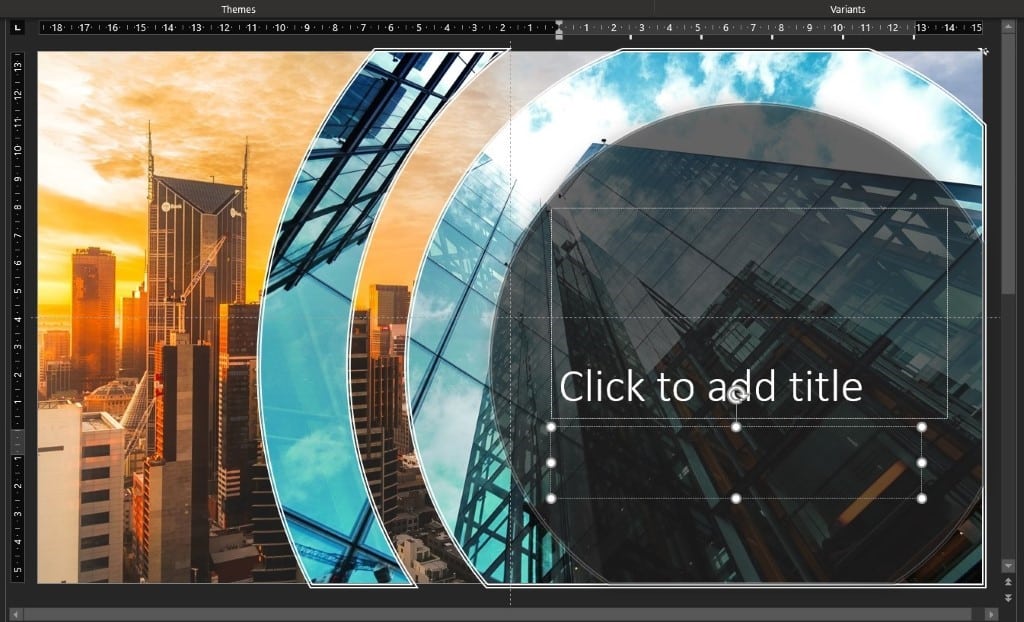
Not bad, eh? A couple of clicks and you’ve got a very stylish looking Presentation.
Don’t like Microsoft’s suggestions? Click at the bottom of the designer pane to scroll down for more.
Design Template
Alternatively, use Designer to suggest an overall look for you r presentation before you begin.
Create a new Blank Slide. As before, Design | Design Ideas and you’ll access the Design Ideas Pane. They should be different this time as it will have a selection of Automatically Generated Ideas for you to ch o ose from
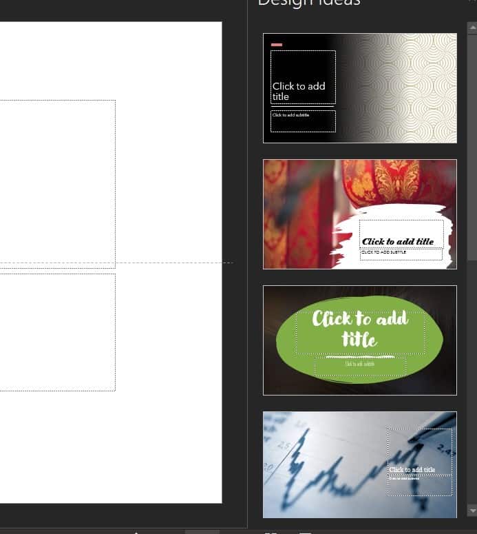
Stand Out from the Crowd
As you can see there are some rather attractive choices here but just bear in mind, this feature ships with PowerPoint by default so there are plenty of other users out there who might choose the same design as you.
Nothing worse than turning up to give a Presentation and discovering that the person before you used the same Theme Style as you!
Most people choose from the first three or four designs offered. A simple way to avoid looking the same as other people is to scroll down the Designer list a few times and select something further down.
Make PowerPoint Designer better, add some words
Stop Designer in PowerPoint
Why PowerPoint Video Backgrounds Should Be Banned
About this author

Jack Randall
Office 2021 - all you need to know . Facts & prices for the new Microsoft Office. Do you need it? Office LTSC is the enterprise licence version of Office 2021.
Office 2024 what's known so far plus educated guesses. Microsoft Office upcoming support end date checklist.
Latest from Office Watch
- Microsoft 365 Insiders blog to end .. sort of
- Effortlessly Migrate Your Notes from Evernote to OneNote
- The ultimate way to change Microsoft Word defaults.
- Three ways to switch language in Word and one way to turn it off
- Grouping values from an Excel list
- Koalas galore in Microsoft Office
- Backstage at a popular show using Microsoft Office
- Copilot gets Make Changes inside Word 365
- Why you should never share a security code
- What to see at Edinburgh Festivals 2024
- Beware variable fonts with Office and PDFs
- Office crashes while typing – the problem and workaround
- Are your old email accounts secure? Microsoft report
- Outlook security hole needs quick patching
- Excel gets Regular Expressions for Xlookup and XMatch
- Clipchamp gets background removal with some gotchas
- Quicker ways to Zoom in Microsoft Office
- Change Word Zoom to custom fixed settings
- British Isles, United Kingdom etc. explained in a simple diagram
- Don’t trust Excel’s Linked Data Types, always verify
20 Presentation Tips to Keep Your Audience Engaged from Start to Finish

Business | Marketing | Nonprofits | Students | Teachers
By kai tomboc - january 14, 2020.
Losing the audience’s attention is one of the most painful challenges for anyone making a presentation.
Halfway through your presentation, you notice that a couple of audience members are getting restless. The people at the back seem bored as they look down on their phones, and one of them just yawned (ugh!).
You start to feel that you failed to engage your audience. You wonder if you’re the problem. Are you a boring presenter? Perhaps you’re stuffing too much information in your slides.
Master audience engagement with these presentation best practices
From engaging product demos to presentation decks that stand out, read on for 20 valuable tips to keep your audience excited to hear more from you.
What makes a great presentation?
Before you get started, it pays to know what makes an excellent presentation.
1. It informs your audience by providing reliable information.
People want to be informed. They want to learn something new. For this reason, you should look for reputable links. The information should be as recent as possible, and at least less than a year old.
Your research work doesn’t need to be from online sources. You could also cite printed sources from the library. Double-check all of your sources and make sure they have substantial research and statistics to back them up.
2. It persuades your audience to take action.
A presentation should be persuasive. This is especially true for business presentations and product demos. You might also want to appeal to your readers through emotions.
3. It educates your audience and empowers them to make informed decisions.
Presentations are, by nature, educational. You might be introducing your audience to a new idea, product, or service.
4. It instructs your audience in a clear, compelling way.
A presentation should be instructional. Organize your presentation as clear and concise as possible, so your audience will be able to digest your information more effectively.
5. It inspires your audience by being memorable.
A good presentation motivates an audience to act on things that they’ve been meaning to do after hearing you speak or present.
20 best pactices for visually-appealing, convincing presentations
With all that in mind, here’s a list of useful best practices and tips for presentations that stick.
1. Know your target audience.

Your target audience is the demographic that you’re aiming to convince, educate, or inspire with your presentation. This crucial step helps you craft a presentation that resonates with your intended audience.
For instance, if you’d like to educate teens, create a presentation that appeals to their age group. Make your presentation more upbeat, and use pop culture references and images that they can relate to.
On the other hand, if your target audience spans middle-aged professionals, your presentation should be straight-to-the-point and based on facts. These professionals are typically results-oriented, and they want to get to the heart of the matter right away.
By and large, getting to know your target audience enables you to create a presentation without wasting time on uninterested demographics.
2. Create an outline.
Your next step is to create an outline of your presentation. It will help ensure order in your presentation and present facts and sources as effectively and efficiently possible.
It’ll also help if you assign a subtopic for each slide. Let’s say your main topic is the American Civil War. The war lasted roughly four years, and if you delve into it without any organizational structure, your audience will end up confused. Sort your slides according to year and the important events that took place. The same applies to any topic.
3. Start with a memorable introduction.
Opening a presentation with “My name is .. ” or “I’m here to talk about..” are less likely to make your presentation memorable and engaging to your audience.
So how do you keep everyone glued to your presentation with a powerful, memorable opener?
Share an anecdote, ask an intriguing question, or get people’s energy up with a short activity.
Next, make your opening slides as eye-catching as possible. In your opening slide, use bold fonts. Add visuals like gifs or an animated infographic.
Finally, provide an overview of your presentation in the introduction slide. An overview that meets your audience’s expectations of your presentation helps keep an audience absorbed and attentive from start to finish.
4. Eliminate clutter in your slides.
Avoid overcrowding your slides with images or graphics. Although it’s fine to use visuals to complement your slides, the keyword here is “complement.”
Too many photos will make your slides look cramped. Take a minimalist approach to your slides. For images and graphics, use them sparingly and thoughtfully.
Don’t be afraid of white space in your slides. Consider readability first, visual appeal second.
5. Use pictograms.
Lengthy presentations could get boring in the long run. So if you want to keep your audience’s attention, you will need to make your presentation attractive and easier to understand.
Enter pictograms !

Pictograms express information, ideas, or messages through images, signs, or symbols. Also, they can help simplify complicated concepts.
6. Be thoughtful of your color scheme.
Your choice of colors can have an impact on your audience’s mood and perception of your presentation. It may not be evident at first glance, but your presentation colors can draw a particular set of feelings from your audience. Orange looks more carefree than beige, right?
Here are some quick tips to help you pick the right color combination for your presentation:
- Choose a color scheme that matches your presentation’s theme. For example, if you’re about to present a serious topic, consider somber, dignified colors like white, black, or brown. But if you want your presentation to be more upbeat, use lighter hues like yellow and orange.
- Use your brand colors to raise brand awareness and recognition.
- Stick to 2-3 colors. Joint research by Adobe and the University of Toronto revealed that most people prefer a combination of 2-3 colors. A good rule of thumb is not to use more than four colors. When using more than 3-4 colors, go for shades, tones, and tints of your original colors like the example below.

7. Focus your audience’s attention using data visualization.
Presenting statistics and percentages in writing can be a challenge to use in your presentation. For this reason, consider data visualization.
For example, graphs and charts are often used to highlight comparisons in data. You can also use them to inform your audience of a specific data point.
It’s worth noting that a poorly-designed graph or chart could ruin your presentation if proven false or shabbily done. Make sure that your data are correct, and your diagrams or charts are correctly labeled. Don’t just use pie charts because they look hip and smart. You have to learn how to choose the right chart or graph to visualize your data.
8. Use presentation templates.
Templates often take a bad rap because they’re perceived as limiting, sapping one of creative freedom. However, templates shouldn’t be perceived this way.
Think of templates as frameworks or a set of building blocks that you can tinker with as you create your presentation. Without a templated structure, you’ll likely waste a lot of time and resources making your presentation from scratch.
For example, use infographic templates as a way to make your presentation more engaging (minus the time-consuming task of making a presentation from scratch. The process infographic template below is perfect if you’re explaining a process in one of your presentations.

9. Try the duotone effect in your presentations.
The duotone effect is the use of two contrasting colors to create dramatic, visually pleasing results. Thus the name duotone.
This design style is gaining popularity with designers and non-designers alike. Learn more from this quick duotone tutorial via Adobe .
10. Show, don’t tell.
Stories are a powerful medium to get your audience to sit up and listen to you. For this reason, aim to “show” rather than “tell” your audience about a topic, insight, or idea.
For example, don’t just state facts or figures about the dangers of not investing in their retirement. Instead, share the story of someone you know who failed to plan for their retirement, nudging your audience towards making their own conclusions or insights.
Don’t bombard your audience with too much information all at once. Avoid jargon or complex concepts without sharing a story that’ll resonate with them. With compelling storytelling, you can create anticipation and then slowly build up to your key points.
11. Incorporate infographics into your presentation.
Infographics are valuable presentation tools because they combine visuals and text. As a result, you can communicate with impact.
Furthermore, infographics make your presentation more memorable. How?

A relevant image paired with informative text helps people retain 65 percent of the information three days later — a stark contrast to presenting text-only content where someone’s likely to remember only 10 percent of the information.
Here are a few guides and tutorials when creating infographics for your next presentation:
- Guide to Making Infographics from Scratch (guide)
- 5 Ways to Use Call to Action in Your Infographic to Boost Audience Engagement (video)
- How to Write Sharp, Compelling Infographic Copy (guide)
Easelly Pro Tip: Divide long infographics into smaller segments. Add an infographic section for each presentation slide. If you’d like to raise the bar further for your presentation, try animated infographics to make your slides come to life.
12. Avoid using bullet points.
Bullet points are great tools to emphasize tips, features, or steps in lists. However, it’s best to avoid them in presentations because they don’t help your audience retain information.
Research even supports this recommendation. In 2014, the International Journal of Business Communication published the results of their research — The Use of Visualization in the Communication of Business Strategies: An Experimental Evaluation .
The researchers wanted to learn whether the use of visuals is superior to text (a bulleted list to be specific) in communicating the strategy of the financial services branch of an international car manufacturer.
The researchers concluded the following:
“Subjects who were exposed to a graphic representation of the strategy paid significantly more attention to, agreed more with, and better recalled the strategy than did subjects who saw a (textually identical) bulleted list version.”
Instead of using bullet points, consider using icons or visuals.
Take a look at the example below. Which do you think will likely get the audience’s attention and be more memorable after the presentation?

13. Choose fonts that are easier to read.
The quality of your font could affect your audience’s reaction to your presentation. Don’t just use the first standard font that pops up in your presentation editor.
Your font should match the mood and intent of your presentation. If you want your presentation to appear casual, choose a font that gives off a similar feeling.
14. Use contrast in your presentation.
Check for contrast between your texts and presentation background to ensure readability. Make it a point to distinguish one from the other.
It’s also worth noting that you are going to show your presentation to a group of people. Depending on the seating arrangement, viewers at the back may find it hard to read your presentation. Make sure that your fonts are of the appropriate size. That way, none of your audience members will have to struggle reading your slides.
15. Consider gifs and memes
Gifs and memes are popular media tools for a good reason. You could incorporate them into your presentation, and they could add a sense of humor to your topic or pitch.
When using gifs and memes, avoid those that could be misinterpreted as politically incorrect or culturally insensitive.
16. Create a consistent look and feel in your slides.
Choose a theme for your presentation templates, and stick with it ’til the end.
This doesn’t mean that you should be boring or dull with your presentation. You can add images and infographics, but there should be a sense of consistency in your slides.
Consistency leads to familiarity, which in turn encourages learning and engagement.
17. Ask intriguing questions.
Asking intriguing questions enables you to draw your audience’s attention and highlight key points at the same time.
For example, you are conducting a presentation on the Roman empire. You want to get your audience’s attention, so you raise questions such as what they know about the Roman empire, and how did the Roman empire impact modern society?
The audience may or may not get the right answers, but they will most likely try their best to answer your questions. The resulting exchange of ideas will make your presentation more spontaneous and engaging.
18. Limit to one visual per slide.
Using too many visuals at once will make your presentation appear cluttered. Limit to one visual per slide to help your audience engage more with your text and information.
19. Embrace white space.
White space , also known as negative space, is the space between the lines of texts and visuals in your presentation. It doesn’t have to be white as it can also take the color of your presentation’s background. Think of white space as “empty space”.
It helps improves readability and ensures that your graphics and texts are clear and legible in your presentation.
20. End your presentation with an excellent call-to-action.
Call-to-action statements are an integral part of any presentation. They compel your audience to take action, and it makes your presentation more interactive.
Here’s a short video explaining how to use call-to-action in infographics (the same principles apply for presentations!):
Say you’re designing a presentation for a new gym you’re managing. You want people to try out the gym and the services you offer. You could incorporate the call to action at the end of your presentation.
“See you at the gym next week?” or “Level up in the New Year by signing up for our free gym membership for a month!” are good call-to-action statements that you can use.
Ready to start creating your presentation?
We’ve got your back if you need help with your visuals and infographics for your next presentation.
Use our simple infographic maker tool or hire one of our infographic design pros for custom infographics and animated infographics .
Here’s to a stellar presentation – we’re rooting for you!
More to learn from the blog…
Warming up the winter with christmas infographics and diy holiday cards.
Besides the actual content, visual elements, and structure of your infographic, another important aspect of an infographic succeeding (e.g....
Infographic Examples. What is an infographic? Examples and templates
What is an infographic? We admit that there’s a lot written out there about this topic, it isn’t hard to find infographic examples ...
Infographics Gone Bad – What to Avoid in Your Design
Infographics are versatile tools that can be a huge help in basically any given field of work or study. They’re catchy, concise, engaging...

5 Tips for Designing Eye-Popping Google Slides

Presentations should capture the attention of viewers and compliment the overall message you are trying to communicate. Design eye-catching Google Slide decks with the help of these five key tips.
1 – Select a Unique Theme
Slick Slides design begins with choosing a great theme. In Google Slides, users can can select a Theme which is the overall design scheme of the slide deck including a specific color palette and font choices. Choose a theme that reflects your personality and style while providing the perfect backdrop to your topic. Instead of using the limited collection of native themes, check out these sites to search through hundreds of free, Creative Commons licensed options.

2 – Vary your Slide Layouts
Within a Theme users can choose from multiple Slide Layouts available which determine the arrangement of text, placeholders for images, titles and more. In a given file users can only select ONE Theme but can easily pivot between multiple Layouts for each slide. Using a variety of layouts helps to break up the monotony of your presentation and allows user to select the format that best fits the content of a given slide. Change the selected layout by navigating to “Slide” –> “Apply Layout”.

3 – Customize Colors
Color choices are important; but less is more. Limit yourself to no more than 5 colors and be sure they are consistent across your slideshow. Consider installing the Eye Dropper Chrome Extension to identify color codes to quickly and exactly match colors for a consistent look throughout your presentation. Trying to figure out how to compliment colors you’ve chosen? Check out the online Color Calculator to choose a beautiful color palette.

4 – Use Text Sparingly
When designing your presentations, remember to use minimal text. Make appropriate decisions about the font size and style so that the text you do use is easy to read. The following size recommendations are a good guideline to follow:
- San Serif Font – Choose fonts such as Arial, Calibri, Helvetica or Veranda.
- Title Font – between 32 and 40 point
- Body Font – between 24 and 32 point
5 – Select Images to Enhance Meaning
Carefully select images that enhance, not distract viewers. Images should help tell the story you are trying to convey. Be consistent with the type of images you use throughout your presentation, whether it be photographs, clip art or icons. Consider these sources to find high quality images. Don’t forget to appropriately cite your sources!
- TheNounProject – Is the ideal location to find icons that can be custom colored and downloaded as transparent images for use. Free accounts are required to cite the source for all images used, but consider the low cost of a premium account which is only $19.99/year for educators.

- Unsplash Photos – This massive, searchable collection of beautiful images is available to the public for personal or commercial use. Though you are not required to cite images , it’s best to do so and model this practice for students. These photos are available to all because of the artistry of many people who deserve to be acknowledged.
- Pics4Learning – If you are looking for a safe, kid-focused collection of images, check out Pics4Learning . This site offers copy write friendly photos and is categorized by topic to make searching simple for young learners.

Working with images in Slides is simple once you understand how to add and edit them. Check out this previous post “ Working with Images in Docs & Slides ” for tips on how to effectively manage images in Slides.
Related Posts

Options for Managing Group Emails
Google Groups can be used effectively to link many people together via email around topics of interest. Active Groups are a great source of information but the volume of emails they can generate can become overwhelming, if not annoying. The following tips can help...
2 min read

Using a Gmail Alias to Manage Incoming Messages
What is a Gmail Alias? Gmail aliases are alternative email addresses for a user. Administrators often use aliases for staff name changes. They can also be used to help staff manage email messages for short term projects or various roles. Since messages are routed...

YouTube Tricks Every Teacher Should Know
YouTube is a fantastic source for videos in the classroom if only teachers didn't need to worry about distracting advertisements, inappropriate comments or annoying "suggested videos". Teachers should know there are some very effective tools that can de-clutter YouTube videos so they are safe and ready to share with students.
3 min read
- Home →
- Blog →
- BLOG →
How to Create Eye Catching Slide Presentations with Canva (Video Tutorial)
")
Hello there peeps
Kim here dropping in with a new blog post. You guys already know that Canva is one of my favorite DIY design tools.
In fact, every product that I’ve created in my online shop to product mock ups that I’ve added to landing pages, I used Canva to create them.
So imagine my surprise when an email landed in my inbox from the folks over at Canva stating that they’ve added a brand new feature that will help you present and Share slide presentations with your audience from within your Canva dashboard.
This is what I’m going to be discussing in this blog post as well as how to create killer presentations with Canva for your business.

Slide Presentation Template from Canva
Prepping for your Slide Presentation
In my time as an online creator and blogger, I’ve had to create tons of slide presentations.
If you’re creating a slide deck for the first time, here are a few tips that I would recommend that may help you prep easier:
- Determine what the topic of your slide presentation will be . Take some time to brainstorm things like " hot topics " in your industry or even questions that your audience has asked repeatedly that they are struggling with. The thing to remember is the power of ONE. Focus on ONE thing that you can help your peeps with.
- Create a strong headline and title for your slide presentation . As with blog posts and etc, you want to make sure that your presentation will grab people’s attention.
- Create an outline for your presentation. Instead of trying to learn things together like crazy it’s best to whip up a quick outline of things that you want to cover in your presentation.This will help you organize your thoughts better and easier for you to create the slide deck as you already know what content you were planning to cover. Are use Google docs for this and would recommend that you check it out.
Things that you can add to your outline include :
- Title of presentation
- Section headers and titles
- Key points for your slide presentation
- Content that you want to cover
15 Things to Include in your Slide Presentations
If you’re trying to figure out what information you should add to your slide presentation, here’s a running checklist: 1. Compelling title of your slide presentation - Here again, think about something that will get people “excited” to view your presentation. 2. An About You/Us slide - With this type of slide, I usually give a little bit of background “personable” information about myself. Like random facts about me, some of the previous companies that I’ve started or other past accomplishments. 3. Your background story - This can include things like your past accomplishments, people that you've worked for and more. 4. Places you’ve been featured - If you’ve been featured in different publications (blogs, websites, or articles) this is a great slide to add that information to. 5. Your logo - branding is key with any presentation that you create. Use this as an opportunity to add your logo to all of your designs. 6. And a gender/overview of what you will discuss - This is where you can give a quick rundown of what you will discuss in your presentation. These are basically the main talking points from your outline and supporting content. 7. Engaging photos - Boring slide presentations = a snoozefest. To spice up your presentations, add engaging photos and visuals to your slides. Here again, Pexels and Pixabay are great resources that you can use to get engaging visuals from. 8. Section headers/Title slides - Use these to break up your main topic and introduce subtopics of your presentation. 9. Relevant statistics and information to back up your topic if necessary - To support your main topic, if there are some supporting statistics and information that you can add, take this as an opportunity to do so. 10. A photo of yourself to personalize your slide deck - I always try to add at least one photo of myself to my slide deck. It really helps personalize your slide presentations and endears your audience to you. 11 . Call to Action (Download a freebie, Schedule a Site Audit, etc) - It doesn't matter if you are selling a product, or if you are giving away something for free, you should always add some sort of call to action to your slides.
For example, if you are trying to grow your email list, then call peeps to “ Download a freebie ”. Or if you are trying to get folks into a sales funnel to upsell them on a product, then maybe adding a “ Contact Us” for a free “ Website Audit ” is great. 12 . Contact Information - This should include links to your active social media accounts, website URL, and your email address. 13 . Product/Service Mockups - Adding these to slides is a great idea if you’re selling etc, product mockup images and links to your sales page. They will help your attendees envision themselves using the product or benefitting from your service. 14. Q&A promp t - Your Q&A slide will give folks an opportunity to ask probing questions related to your presentation. 15 . Thank You Slide - Thank your attendees for taking the time to view your slide presentation. You can also use this as another opportunity to connect with you on social media.
Types of Slide Presentations To Choose From in Canva
Creating beautiful slide presentations with Canva has never been easier. They have an extensive collection of templates to choose from some of which that include:
Creative Presentations
These are perfect for peeps that want a spicier and festive look to their presentations. For example, if you are creating a course, or an online workshop of sorts, then this is probably the kind of template that you may want to use.

Creative Slide Presentation in Canva
Education Based Presentations
If you are an educator , Canva has plenty of awesome education centered and focused slide presentation templates that you can use to wow your students.
Take this template set as an example:

Education Based Templates in Canva
Do you see how cute this is?
You can easily change the colors of the slide deck, add images to them and more to create a super cute presentation for students. Yeppers...it’s just that easy.
Business Presentations
Run a business and need a professional slide deck to present to business partners, investors and etc? No problemo.
Canva has a template that you can use. Here again, instead of scratching your head and starting from scratch trying to design the perfect slide deck, just grab a template, change colors, add photos, and that's it.
Here’s an example of a great set of slide presentations that you can use:

Business Presentation Template Canva
Designing Slide Presentations with Canva
So we’ve come to the front part.
It’s time to design an amazing slide presentation with Canva . I’ve also added a video tutorial that shows you step by step how to get it done.
Here’s a step by step guide to designing slide presentations with Canva :
#1: Sign up for an account with Canva

Canva sign up
#2: Choose a color scheme to brand your slide presentation with . This tool is helpful.

Color Palettes Tool
#3 . After logging into your Canva , on the right side of your dashboard, it's time to choose a presentation. You can do this in one of three ways: One by typing in “ Presentation ” into the search bar underneath “ Design Anything ”.

Presentation search
Or you can click on “ Presentation ” underneath the “ Recommended ” section.

Choosing a presentation
#4: After clicking on the “ Presentation ”, Canva will generate a list of templates in the left side of your dashboard that you can use.

Presentations templates in Canva
#5: Next, find a slide presentation template that you want to use . Canva has a ton of them to choose from.
After you find the slide presentation that you want to use, click on it to add it to your workspace.
After you click on the presentation that you want to use, you will get a prompt that says “ Apply all X pages ”. So for example, if your template has 16 pages, you will click the button that says “ Apply All 16 pages ”. See the screenshot below

Apply all pages to workspace
#6: Start branding your slide presentation. Using Colorpalettes.net will come in handy. Simply select a palette, and apply it to your slide presentation.
Now if you have a brand kit in Canva , you can simply apply colors from your Brand Kit to your slide presentation.

Branding slide decks in Canva
#7 : Add content to your slide presentation. Try to keep each slot to no more than 100 words per slot to give people the opportunity to skim through slide decks for main points and takeaways.

Adding Content to Slide Deck
#8 : Add your visuals/engagement photos to your slides. Here again Pexels and Pixabay have amazing free gorgeous images that you can use.
I also forgot to mention that Canva has a ton of free images that you can use as well to add to your slides.
#9 : Check your slides for spelling and grammatical errors and etc.
#10 : Once your presentation is good to go it's time to present your slide deck. To do this, in Canva click the “ Present ” button to go into presentation mode. Click the “ Standard ” view.

Presenting your slide deck
#11: Your slide presentation should now be showing up in your Canva dashboard. There are a few controls at the bottom of your slide presentation that you should be mindful of.
Here is what they look like:

These controls are used for:
Restarting your presentation from scratch
The little arrows on each slide (are to move your slide deck forward or backwards)
The last two little arrows (are to help you exit the screen)
Additional Things You Can Do with Canva’s Slide Presentation Feature
#1: Screen Record your presentation . Yep that's right. I typically use Screencast O'Matic to record my screens and Filmora to edit all of my videos. However, inside of Canva’s presentation tool, there is an option to record your screen.

Additional Slide Presentation Features in Canva
To do this, while in “ Presentation ” mode, simply click on the “ Button ” with the three little dots. Next, click on “ Present and Record ” to record your screen.

Present and record Canva Feature
#2: Create Animated Slide Presentations . This is pretty neat right. With most slide presentations if you want something “ Animated ” you will have to go slide by slide to animate something in them.
However, with Canva , all you have to do is select an “ Animated ” slide presentation, edit your templates and that's it.
#3: The ability to download your presentation as a “ Powerpoint ”. This.is.huge! If you are more comfortable with sharing Powerpoint presentations, then you can use this option.
#4: You can embed your slide presentation into your website. Canva has an “embed” feature that allows you to do this.
#5: You can download your slides as multiple formats. This includes “ Graphic ” files (PNG, JPG), PDF’s , GIF (animations) and more.
Wrapping Things Up
Guys, I don’t know about you but I am super excited that Canva has added this new feature to their design tool.
Instead of struggling to design presentations from scratch or even spending money on tools for screen recording, they have definitely created a one stop shop tool that anyone can use to create eye catching slide presentations with Canva .
Thanks so much for reading peeps!
Peas out...
Related Posts
How to Use Canva: 101 Passive Income Products + Designs You Can Create (Includes PDF)
How to Design Stationery with Canva (Video Included)
How to Create and Sell Canva Templates Online [Includes VIDEO]
10 of the Best KDP Niches in 2023 for Low Content Books


How to Make an Eye-catching Video Presentation in Minutes | InVideo
- video presentation

Video is now the undisputed king of mediums in business communication. HubSpot reports that 85% of companies use videos in their marketing efforts. From webinars to demos, from sales presentations to investor pitches, and from welcome videos to online tutorials, videos are the go-to channel. Clearly, video marketing is on the surge.
And video presentations are among the most widely used formats for video marketing. But how exactly can you create winning video presentations, to begin with?
Simply by signing up to InVideo for business where you get tailor-made template and video editing services on demand so you can spend your time running your business. Sign up for a free demo here.
Video Presentations Q&A
Before we get into the meat of our guide, let’s quickly answer a few commonly asked questions.
1. What is a Video Presentation?
A video presentation is a form of communicating with an audience with the aid of a video or completely using a video. The video could be made of PowerPoint slides , still images, animation, or actual video footage.
2. Why Should I use Video Presentations?
Common reasons for using videos as presentation aids include:
- Overcoming space/time limitations - Using video as a visual aide to drive your point home - Video enables you to compress a lot of information into a digestible size
3. How do I make a Video Presentation?
Thanks to the advancements in technology, making video presentations has become very easy. It has also become more affordable than it was a couple of years ago. While different video makers have different steps to take when making a video , here are the basic steps to follow:
- Come up with a concept for your presentation. - Craft an engaging script . - Decide on the visual assets (and format) you’ll use. - Use a professional video editing app to bring it all together. - Promote the video.
Pro tip: To make things even easier, you could sign up to InVideo for business and get presentations made for your brand using the editing-on-demand services. Sign up for a free demo here .
4. How do you begin a Presentation?
You can open your presentation in 7 ways:
1. Share an anecdote or short personal story. 2. Kick-off with a provocative statement. 3. Present a startling statistic or data. 4. Tell a good clean joke that suits the audience. 5. Ask a loaded rhetorical question. 6. Show the audience a compelling visual. 7. Hook people with a fascinating quotation.
5. How do you Make a Video Presentation with PowerPoint?
Turning a PowerPoint presentation into a video is easy. Just follow these steps:
Step 1: On the File menu, select Save to make sure you have saved all your recent work in PowerPoint presentation format (.pptx).
Step 2: On the File menu, select Save As .
Step 3: Select the folder location where you want to store your PowerPoint Show file.
Step 4: In the Save as type box, choose PowerPoint Show (*.ppsx) .

Step 5: Select Save . That’s it.
Now that we’ve answered a few basic questions, let’s dig deeper into why videos are so powerful.
What Makes Video Presentations so Effective?
Why do they increase the impact of your message?
Well, it’s simple, really – people are visual creatures. This means we take in more information by watching than by reading. Remember the saying, “a picture is worth a thousand words”? Besides that, here are 4 other reasons video is so effective:
1. Conveys emotions better
No other communication channel conveys emotions better than video. That’s because video caters to the brain’s visual and auditory systems, helping the viewer pick up on cues like body language, facial expressions, imagery, and music.
2. Cements information better
According to research , people remember 10% of what they hear and 20% of what they read. However, they remember a staggering 80% of what they experienced. In short, visuals are easier to remember than text or audio because they help your audience “experience” your message. It makes video an essential part of creating presentations your audience will remember for a long time.
3. Makes it easier to digest information
Especially when explaining complicated concepts, video is a great way to present information in an easy-to-understand way. Not only is the format easy to take in, but it also makes breaking down concepts easier.
4. Builds relationships fast
I’m sure you know the marketing mantra: people buy from people they know, like, and trust. Nothing beats video in making prospects or your audience know, like, and trust you… fast. Video is an instant relationship builder. It’s the next best thing to live face-to-face communication.
A video is a great tool that has made it easier to communicate thoughts and ideas with people – not just in a room, but even across the globe.
6 Types of Video Presentations You Need to Know
Video presentations come in different flavors, depending on their purpose.

1. Educational Presentations
These are mainly used in teaching and learning sets online or in a classroom setting. These make it easier for the teacher to convey information and the students to grasp the concepts.
Use this template
2. Sales Presentations
The field of sales has evolved tremendously in the past decade. With customers being savvier, sales reps must play the game well if they’re to bag sales. One way they can do that is by creating story-based sales video presentations.
Sell more with pro video presentations
Use 5000+ InVideo templates to get started

3. Investor Pitches
Need to woo an investor? One of the best ways to do that is by using a video pitch. This will help you present your business plan in a visually appealing way so they can easily grasp your business concept.
4. Promotional Videos
Whether you’re promoting an existing product or a new one, video is your best bet for getting eyeballs on your product (or cause). People relate better to what they can see, making video the best medium for presenting your promotions (like product reviews, for example).
5. Employee Training and Onboarding
Video presentations are great for conducting employee training and onboarding. One of the main reasons for this is that video helps reduce the resources spent on these 2 important aspects of employee relationship management.
6. Informational Videos
As the name suggests, the informational/how-to type of presentation serves to pass on important information. Why video in this case? Because it’s more engaging and can pack a lot of information in a short clip.
Pro tip: You can get tailor-made templates to create any kind of presentation for your brand or business using InVideo for business . Sign up for a free demo here .
How to create killer Video Presentations – 4 Tips
Now you know why video presentations are important and which scenarios to use them in. Now to the fun part – tips on creating killer video presentations. Let’s get to it, shall we?
Tip #1 - Know your Audience

The most important aspect of creating a stellar presentation is to know and understand your audience. Even if you use the best video presentation maker , if you don’t target a specific, clearly defined audience, your presentation will flop. Understanding your audience will help you:
A. Communicate effectively
Effective communication involves knowing the language and examples that resonate with your audience.
B. Choose the right visuals
Certain visuals are more impactful when used on a particular audience. Study those that your audience will easily understand and relate to.
C. Connect on an emotional level
No matter the type of presentation, it’s crucial to connect with your audience on an emotional level. And to do that, you need to understand the emotional triggers to push in your video presentation.
Invest in adequate audience research. While it may be time-consuming (and a bit costly), it will pay off in the end.
Idea #2 - Brainstorm video content ideas

Now that you have gathered enough audience data, it’s time to brainstorm some content ideas. Whether you’re creating your talk solo or as a team, 3 crucial questions will lay the foundation of your brainstorming session:
1. What do you want the video to achieve? 2. Which emotions do you want the video to evoke? 3. What will visual elements help your video achieve its goal?
The answers to these questions will help guide your ideas. They are key to creating a killer video that your audience will love.
Tip #3 - Craft engaging scripts

Audience research? Check.
Great idea? Check.
Now we get to another interesting stage of creating great video presentations – crafting an engaging script. Whether it’s a live presentation, a webinar, or even a product review, you’ll need a great script to ensure you keep your audience engaged.
Even if you love creating impromptu videos, having a script for your video presentations is important. And no, you need not be Quentin Tarantino to produce a great video script (although it won’t hurt to learn how to become a good copywriter). Here are 3 reasons a good video script is a must:
1) Helps structure your video
To ensure your video has a smooth and progressive flow, you’ll need a good script.
2) Eliminates “dead spots”
Dead spots, or moments of inactivity, are a great turn-off in a video. They reek of unprofessionalism and can lead to your audience disengaging. The best way to eliminate dead spots is to craft a solid video script .
3) Keeps you on track
It’s very easy to get sidetracked when creating a video . However, with a script, you minimize the instances of going off-topic.
Creating scripts for your videos is a best practice that shouldn’t be overlooked. If anything, invest more in your script than the visuals as a good script can save a video with poor visuals.
Pro-tip: Once you’re confident about your script, it is time to make things even more clear. A storyboard will allow you to break down your video visually, scene by scene, describing what is happening in it.
Tip #4 - Invest in the Right Tools

With video, one thing you should never skimp on is the tools you use, particularly your video editing software. While there is a gazillion free video editing software on the market, it’s highly recommended that you use a professional video editor . And that means going the paid route.
Why should you spend on a video editor when there are countless free options available? Here’s why:
A. Get more (professional) features
Creating professional-looking videos requires a lot of resources and features. Most free video editors lack the features that will enable you to create professional videos.
B. Avoid branding and ads
With video editing software, free is never free. That’s because you pay through being forced to include the video editors brand in your work. In other words, you pay by advertising for them. Besides branding, some free video editors may subject you to irritating in-app ads.
If there’s one thing that’s inevitable when it comes to software, it’s that one time or another you’ll encounter glitches. This is where paid video editors have a great advantage over their free counterparts – you’ll have access to customer support.
From hardware (like cameras) to software (like video editing software), the tools you use will determine the quality of your videos. Invest in professional tools, and your presentations will sweep your audience off their feet because they’ll be more polished.
Pro tip: If you don't have the time or bandwidth to find your way around an editing tool, simply sign up to InVideo for business and get presentations created using tailor-made templates and on-demand editing services. Sign up for a free demo here .
Tip #5 - Adopt Video Presentation Best Practices
There’s no need to reinvent the wheel when creating presentations . Most winning video presentations are based on common fundamental principles that work. Here are some you need to know:
1) Create impactful intros (and outros)
Your intro is the most important part of your presentation as it sets the tone for the rest of the talk. If you can’t engage your audience with your intro, you probably won’t get another chance to engage them.
2) Keep it short, sharp, and sweet
No matter how engaging your video is, always remember it’s not a movie. The point is to keep your audience engaged enough to pass on your information, no more no less.
3) Be professional
Don’t throw out your professional etiquette just because you’re on (or using) video. Maintain professionalism in your video presentations by, for example, using clean language and maintaining a good posture.
4) Use quality sound
Sound plays an integral part in presentations. Whether it’s music or speech, make sure it’s crisp, clear, and audible.
By following these (and other) video presentation best practices, success is inevitable. Remember, the presentation is not about you; it’s about your audience. So, ensure that your presentations provide a good user experience for your audience.
Make video presentations in minutes
With customizable InVideo templates

Looking for a great Video Presentation Template? Here’s what you should consider

Templates are lifesavers. They help you create a decent presentation in a snap, even if you are a newbie.
Here are 3 simple questions to help you determine if a template is good:
1) Is it editable? – Are you able to change things like playback speed, effects, or text, so you produce something you like? Stay away from rigid templates that don’t give you the freedom to create with ease.
2) Is it customizable? – Can you design brand-specific clips using your company’s colors, fonts, and styling? Good templates give you wiggle room to include your brand’s specific needs.
3) Is it campaign-specific? – Different videos fit different scenarios. Ideally, you want templates tailored to your current campaign. That way, you have less tweaking to do because the templates are close to what you want.
Pro Tip: Get more tailor-made templates for your video presentations by signing up to InVideo for business . Sign up for a free demo here .
5 Awesome Video Presentation ideas to bring The House Down
Presentation is both an art and science. Get the balance right, and you have the audience eating out of the palm of your hand. Here are some ideas to help you do just that.
Idea #1 - Tickle them with humor
Humor is a powerful learning tool.
According to studies by Physiology Org humor leads to learning because of it:
- Attracts and sustains attention. - Relieves tension and produces a relaxed atmosphere. - Enhances participation. - Increases retention and motivation. - Bonds the student and the teacher.
However, to reap all these benefits, the humor must be appropriate and on-topic. So spice up your presentation with a joke or two. The result? Your audience will laugh and learn.
Idea #2 - Use Relevant Examples
Effective presenters use timely, powerful illustrations.
The word illustration comes from the Latin term ‘illustration,’ which means illumination. So practical examples are like windows of your presentation. They let light in. They help people see or understand the material better.
Here are 5 questions to ask about your illustrations:
1. Are they relevant to the topic? 2. Are they suited to the audience? 3. Are they suited to the time limit? 4. Are they enlightening? 5. Are they well told?
Grab compelling examples from books, movies, TV shows, history, children, current events, and captivating real-life incidents. Use good illustrations ram your points home.
Idea #3 - Wield Questions like a Ninja
Questions are an integral part of learning.
Sharp questions aid learning. Plus, they keep listeners highly engaged.
Ask questions:
- At the beginning of your presentation to draw your audience in. - In the middle of the presentation to revive waning audience interest. - At the end of the talk, so the audience reflects on the material.
Also, allow the audience to ask questions. When your audience asks questions, they switch from passive spectators to active participants.
Idea #4 - Be Minimal
Have you ever sat through a presentation and felt:
- Dazed? - Confused? - Strained?
More than likely, the reason is the presenter drowned you in a blaze of inessential stuff. There was too much going on you couldn’t cope with.
Minimalism is removing all unnecessary material, leaving only the bare minimum needed to put your points across. It means using just enough text, visuals, scenes, or slides to make the point and no more. A minimal presentation is clean and uncluttered.
Simple yet intriguing. Plain but profound. Basic but punchy.
Most importantly, it makes learning easy and enjoyable.
Idea #5 - Connect emotionally with a story
Stories are speakers’ most powerful weapons. That’s because stories play a dual purpose –
- Engage intellectually - Connect Emotionally
And an emotional connection is key to bringing the house down with your presentation. Why?
An emotional connection:
- Endears you to your audience - Makes your presentation memorable - Inspires your audience to take action
By using a relevant story in your video presentation, you’ll ensure that your audience walks the entire journey with you from intro to outro.
6 PowerPoint Presentation tips to wow your audience

No business video guide is complete without PowerPoint, the staple software for business presentations.
Here are 6 golden rules to help you nail your next PowerPoint presentation and leave your audience crying for more:
1. Keep Things Simple
Legendary artist Leonardo da Vinci once said something profound:
"Simplicity is the ultimate sophistication".
With the plethora of apps and templates at your disposal, you will be tempted to complicate things. Don’t. Keep things simple.
Simple design. Simple colors. Simple story.
People get swamped and confused by complicated stuff but easily absorb and appreciate straightforward material.
2. Good visual contrast
What use is your blockbuster presentation if the audience can’t see it?
You want people to enjoy your presentation, not endure it. If you use dark fonts on dark backgrounds or light fonts on light backgrounds, you’ll strain your audience’s eyes. They’ll struggle to see your lovely slides.
Classic black-on-white color contrast does just fine. You can use colors like red, blue, or yellow for headings and images. If you don’t like black and white, you can use other colors you prefer as long as the contrast of your combination is bold and strong.
3. Use a few words and animations
It’s easy to go overboard with fancy animations and a gushing stream of words. Only use as many words as it takes to get your point across and no more.
Too many words cause the audience to read rather than listen. Remember, your slides are there to compliment your talk, not substitute it. Also, a lot of words will fill up many slides that wear your audience down.
Ruthlessly cut out senseless animations that don’t add value to your talk.
4. Use excellent images
Images are to a presentation, what water is to fish. Without them, your presentation becomes bland. It lacks the needed fizz to keep your audience hooked. But only include relevant images.
Not only that. Above all, make sure all pictures are of high quality. Amateur-looking clip art causes the audience not to take you seriously.
Pro-tip: Get access to millions of stock assets and tailor-made templates with InVideo for business . Sign up for a free demo here .
5. Smooth and fast transitions
While PowerPoint transitions can make your presentation engaging, don’t overdo them, especially the advanced ones. Not only do they quickly drain power on weaker machines, but they also distract the audience. Stick to simpler and faster transitions like wipe or slide.
6. Avoid overloading your slides
In presentations, less is more.
Having a lot going on your screen confuses and overwhelms listeners.
Cramming too much info into your slides is a big no-no. Clutter is your enemy. Strip your slides down to essential words and images. Your audience will love you for it and leave you with many takeaways.
Pro looking Video Presentations – No longer an option
With Industry 4.0 fast coming into its own, going digital is no longer an option for businesses and speakers.
And one of the most important communication mediums in the digital age is video. That’s why you can’t afford to ignore video any more. Whether you’re speaking before a live audience or seeking to disseminate information to a global audience, video presentations are the way to go.
Need a great tool to create stunning video presentations? Then make sure to schedule a demo and see just how much you can do with InVideo for business.
Let’s create superb videos
6 Tips to Create an Eye-Catching Presentation Cover Page

Table of Contents
- What Is a Presentation Cover Page?
6 Tips to Create a Winning Presentation Cover Page
- Key Takeaways
- Conclusion
A good presentation cover page is just as important as the content inside it, but a great one will also draw attention and give your presentation an extra lift. By drawing attention to your presentation’s topic upfront, you can compel your audience to want to know more about what you have to say.
The cover page is one of the first things the audience will notice about your presentation. So, you must make a good first impression, and immediately. An effective PowerPoint cover page can set the tone for your entire presentation, and engage the audience from the get-go. And to get better at creating presentation cover page designs , you need to understand what an ideal presentation cover page is.

What Is a Presentation Cover Page?
When it comes to presentations, don’t underestimate the value of a powerful and captivating title slide. It’s one of the easiest and quickest ways to get people’s attention. A sound presentation cover page design helps achieve two crucial goals.
- Clarity in terms of the topic
- A strong introduction to your brand
In a nutshell, your PowerPoint cover page (or any other presentation cover page for that matter) exposes your viewers to the main points of your presentation. It should also pique their interest and make them want to hear more. Now, let’s move on and understand the steps involved in creating a stunning cover page .
The cover page of the presentation is often the first clue that people get about what you are going to speak about. Therefore, you need to make sure that it’s clear, concise, and compelling. To ensure this, we have put together a few easy tips for you.
1. Come up with a catchy title
It’s ideal to come up with a title that’s plain, descriptive, and easy if you’re delivering a presentation to a bunch of people who don’t know much of what you’re going to say. If you’re having trouble cutting down a long title, you can include a subtitle underneath that explains what you’ll be delivering information on.
You can get away with anything more intriguing or artistic, depending on the topic of your presentation, but make sure your title is not too obscure or incomprehensible. For example, the title in the below-mentioned slide is easy to understand and captivating as well. Notice how the word “Conference” has been highlighted and is followed by supplementary text underneath.
2. Check the overall tone
Why does the tone of your presentation, specifically the cover page, matter so much?
The cover page paves the way for the rest of your presentation, and audiences are quick enough to decide whether they want to continue watching the presentation judging by its tone. But what do we mean by tone? In this context, tone means the overall style of the presentation.
A presentation cover page must dictate the objective in a professional yet quirky manner to attract and retain your audience’s attention. It should represent the worthiness and quality of your overall content.
Apart from that, recently, aesthetics have become the topmost priority for many marketers. We, as humans, find aesthetics in everything, and easily get attracted to it. That’s why having an informative yet aesthetic cover page can set you apart from your competitors.
Here’s an example of how tone and aesthetics should go together in a presentation cover page design.

3. Humanize your cover page
Humans are emotional beings. A good presentation page can do more than just present the work; it can set an emotional tone for the rest of the site.
You want to be able to wow people with your presentation, but that doesn’t mean you need to be flashy, unemotional, or insensitive. On the contrary, if you create a cover page that uses emotions to get people excited about your work, nothing like it. They will not only know what to expect but will also be able to connect with your presentation on a deeper level.
Let’s look at an example of an emotion-driven approach for presentation cover pages.
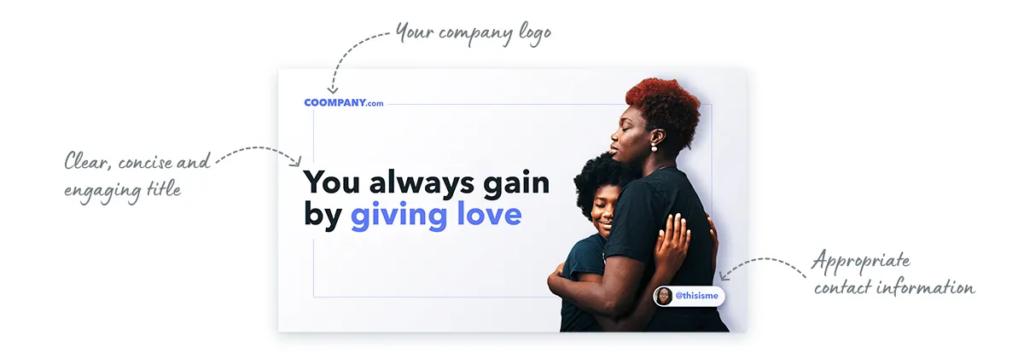
4. Shed some light on your brand
While it’s great to illustrate your objective on the cover page, it is also equally crucial to throw some light on your brand. In general, the opening page of your deck should convey what your company does. After all, it’s the first impression people will have of your company or project.
While you may be tempted to include your own photo and contact information on the cover page, it may be more appropriate to emphasize your team or brand instead.
Here’s a brilliant example.

5. Keep it simple
As a content creator, you must make presentation cover page designs that educate and inform your audiences. You can do so effectively by going minimalistic.
Having too many pictures and words can distract the audience and confuse them. That is why having a minimal background is extremely important. It also lends professional and clarity to your presentation.
Check out this example to get a sense of what a minimalistic cover page should look like.

6. Use bold fonts
Last but not least, you should use bold fonts to display your ideas perfectly on the cover page. Strong fonts that include letters and numbers will attract eyeballs immediately.
Therefore, whenever you’re preparing a presentation cover page design, make sure you’re using bold and simple fonts, and not complex and thin fonts.
Here’s an example of a presentation cover page that has a bold font.

Key Takeaways
- A presentation cover page is a basis on which your audience decides whether to give their attention to the rest of the deck.
- To create a stunning cover page for your presentation, you need to ensure it has a catchy and short title.
- The cover page should go well with your brand’s tonality.
- Ensure you add emotions to attract your readers.
- Add a little about your brand/business as well.
- Follow a coherent tone for the cover page, which can be carried forward to the rest of the presentation.
- Smartly use bold fonts to capture the audience’s attention.
The cover page of your presentation is the first thing your audience will see. So, it’s important to make a great first impression with it. A well-designed presentation cover page can highlight the topics of your presentation and pique the interest of your audience. You’ll want to keep the design simple and clean.
In order to create a stunning cover page for your presentation, there are certain things you need to take care of and implement. For starters, you can keep your title short, and if there’s something more you want to add to the title, you can insert it as a subhead. Next, you should add some emotion to your cover page to gain your viewer’s attention. Apart from this, you should try and experiment with bold fonts, as they catch the viewer’s attention immediately.
You must also add a minimalistic background to your cover pages, as too much information and pictures can confuse the viewers. And lastly, do not forget to add information about your brand or business to get your viewers acquainted with it. Remember, a great cover page can win half of your viewer’s heart, so make sure to make it as stunning as possible.
A presentation cover page is the first thing your viewer gets to see. Basically, it is the first slide that informs your viewers about the presentation and its objectives.
An ideal PowerPoint cover page should have a captivating title, engaging imagery, and details about the company.
For the cover page, you should use bold fonts to attract the viewer’s attention and make a lasting impact.
Yes, infographics help give viewers a clearer picture of your message. They may make them proactive listeners as well as responders.
Numbers attract viewers. So if you have statistics to back your claims, and if they’re relevant or fit the title, you should definitely go ahead and use them.
Latest Blogs
In this blog, explore the golden rules of using AI marketing tools so you can leverage the benefits to their maximum potential.
In this blog, you’ll learn how to avoid the pitfalls of SEO over-optimization while enhancing your site’s performance.
In this article, we’ll take a look at what AMP is, its advantages and disadvantages, and how it affects SEO.
Get your hands on the latest news!
Similar posts.

10 mins read
How to Start a Successful Food Blog in 2022

4 mins read
10 Best Translation Blogs To Follow In 2022

11 mins read
What Type Of Media Can You Add To Make A Blog Post More Interesting?
- Meet Lynnette
- Money Coach University™
- Connect with an Advisor
Disclosures

How To Make An Eye-Catching Business Presentation
- By: AskTheMoneyCoach
A presentation is a powerful tool for getting your ideas across to an audience. It can be used to present an entire business plan, or it can simply be a way to introduce yourself, your company or your product to potential customers.
The art of creating an eye-catching business presentation is not easy. If you want to create a business presentation that will make your audience sit up and take notice, then you need to follow these tips on how to make an eye-catching business presentation:
Start With a Compelling Opening Slide
Grab your audience’s attention from the start with a visually striking and attention-grabbing opening slide. Use powerful images , bold typography, or dynamic visuals that represent the topic or theme of your presentation. A compelling opening slide sets the tone for your entire presentation and hooks your audience right away.
Employ The Power Of Storytelling
Weave a compelling narrative throughout your presentation to captivate your audience. Use stories, anecdotes, or real-life examples to make your content relatable and memorable. People connect with stories, so incorporating storytelling into your presentation can make it more engaging and impactful. Storytelling can also help you create an emotional connection with your audience, making them more likely to remember your message.
Include Compelling Visuals
Visuals play a crucial role in capturing the audience’s attention and enhancing their understanding of your content. Use high-quality images, charts, graphs, or infographics to visually represent your data or key points. Make sure the visuals are relevant and enhance your message rather than distract from it. Visuals also break the monotony of text-heavy slides and make your presentation more engaging.
Incorporate Engaging Multimedia Elements
Consider using video or audio elements strategically to add variety and enhance the impact of your presentation. Use short video clips, lyric videos , or audio snippets to illustrate key points, or demonstrate your product or service in action. Multimedia elements can make your presentation more dynamic and creative.
Practice Effective Slide Composition
Keep your slides concise and avoid overcrowding them with excessive text. Use bullet points or short phrases instead of lengthy paragraphs. Maintain a good balance between text and visuals on each slide to keep your audience engaged. Use appropriate headings and subheadings to help organize your content and make it easier to follow.
(Read More: 5 Mistakes to Avoid When Starting a Business )
Use effective transitions.
Smooth transitions between slides can help maintain the flow and cohesiveness of your presentation. Utilize slide transitions, animated gifs , or fade-ins to create a seamless visual experience. Transitions should be subtle and purposeful, enhancing the overall presentation rather than distracting from it.
Incorporate Interactive Elements
Engage your audience actively by including interactive elements in your presentation. Use polls, quizzes, or interactive exercises to encourage participation and keep your audience involved throughout the presentation. This not only makes the presentation more engaging but also helps in reinforcing key points and ensuring better retention of information.
Key Takeaway
Presentations can be a huge boon to your business. That is why your business presentation should be persuasive, and professional, and it should have all the components of a great presentation. To avoid boredom, the presenter should also prevent the audience from falling asleep through an interesting structure, personal experience or good humor. Another thing that will help you win your audience’s attention is a fascinating subject; something new, something unexpected, something which makes them think and make comments. Well-structured presentations can lead to many positive consequences: people are more willing to buy your products or services, they are more interested in learning more about your company and its offerings, they see you as an expert on the subject matter—someone they can trust.
Tags: Business Presentation Tips , Effective Slide Design , Engaging Business Presentations , Eye-Catching Presentations , PowerPoint Tips , Presentation Design , Visual Communication
Recent Posts
The ultimate guide to finding your lost money, the psychology of automated investing, how to leave a solid legacy on a modest income, how to redesign your dining room on a budget.
Common Financial Mistakes to Avoid During Divorce
5 Reasons Why You Need a Financial Advisor—Even If You’re Good With Money
Bounce Back book

Bounce Back: The Ultimate Guide to Financial Resilience

Bounce Back Workbook
Related post.

Bestselling Author Reveals How to “Bounce Back” from Financial Challenges in 2024

Stay Connected
©2009-2024 TheMoneyCoach.net, LLC . All Rights Reserved.
RSS / Sitemap / Submit an Article / Privacy Policy / LynnetteKhalfaniCox.com
Do Not Sell My Personal Information / Acceptable Use Policy / DSAR / Cookie Policy
Disclaimer / Limit the Use of My Sensitive Personal Information /
Hosting by Hostinger
We use essential cookies to make Venngage work. By clicking “Accept All Cookies”, you agree to the storing of cookies on your device to enhance site navigation, analyze site usage, and assist in our marketing efforts.
Manage Cookies
Cookies and similar technologies collect certain information about how you’re using our website. Some of them are essential, and without them you wouldn’t be able to use Venngage. But others are optional, and you get to choose whether we use them or not.
Strictly Necessary Cookies
These cookies are always on, as they’re essential for making Venngage work, and making it safe. Without these cookies, services you’ve asked for can’t be provided.
Show cookie providers
- Google Login
Functionality Cookies
These cookies help us provide enhanced functionality and personalisation, and remember your settings. They may be set by us or by third party providers.
Performance Cookies
These cookies help us analyze how many people are using Venngage, where they come from and how they're using it. If you opt out of these cookies, we can’t get feedback to make Venngage better for you and all our users.
- Google Analytics
Targeting Cookies
These cookies are set by our advertising partners to track your activity and show you relevant Venngage ads on other sites as you browse the internet.
- Google Tag Manager
- Infographics
- Daily Infographics
- Popular Templates
- Accessibility
- Graphic Design
- Graphs and Charts
- Data Visualization
- Human Resources
- Beginner Guides
Blog Infographics 5 Tricks and Tips to Creating That Eye-Catching Infographics
5 Tricks and Tips to Creating That Eye-Catching Infographics
Written by: Ann Smarty Mar 20, 2020
Let’s face it: Online marketing trends come and go so fast, most businesses find it impossible to keep up. One day you’re creating a newspaper ad for your business; 72 days later you can’t pry yourself away from Twitter.

People are constantly on the move, so it makes sense that marketing trends, especially online ones, would struggle to stay fresh and exciting. However, there are a few online tactics, such as a few of the major social media networks and email marketing, which have been able to stand the test of time and remain profitable for businesses.
For those who are unfamiliar, an infographic stands for “information graphic” and is designed to share information or knowledge visually.
Well, technically anything with a picture can be considered an infographic – a street sign, the weather report, graphs, and charts – consumers typically think of infographics as something they see online.
Companies are utilizing these graphics to help consumers understand complicated topics in business. Consider a few of the advantages of creating a company infographic:
Advantages of an Infographic
- Infographics capture a reader’s attention. They are generally flashy and more exciting than plain text. According to researchers, about 87% of web users who saw an infographic felt like reading the accompanying content while only about 40% read the text of a standard page.
- Infographics are easy to understand. As stated above, business topics can sometimes be somewhat dry and confusing, which makes reading an article about them almost unbearable.
- Infographics work similarly to articles in terms of SEO. For example, if someone links back to your article, it improves your SEO ranking. This works the same way for infographics, but they are a much more desirable link for websites because of the reasons stated above. This will therefore up your chances to get mentioned in an article.
Most business owners or marketing department heads actually agree that making an infographic can be fun because it allows your company to show its creativity.
You can use our infographic maker to easily create cool information graphics. There are a few things to keep in mind when discussing the graphic with your designers. This can sometimes feel like a complicated process, but if you know what you’re looking for and you know the way an infographic is supposed to work then the fun can begin. Consider a few of the tips for creating a successful infographic:
5 Tips to Creating a Successful Infographic
1. infographics are not meant to be general: think specific.
Infographics are about getting down to those confusing little details. You do not want to create an infographic that is very general because usually general subjects can be discussed easily with plain text.

A tip: Start specific and then go broad.
2. Infographics are NOT simple charts and diagrams: Think Interaction
If you want to get technical, a chart can be considered an infographic. However, many businesses today are beginning to create infographics with icons and funny design elements.

Most importantly, many of these graphics actually take readers through a series of slides to help them make their decisions. This allows readers to be interactive and remain engaged.
Using new, even AI-powered website builders , you can create interactive experiences for your infographics pretty easily, Wix comes with quite a few cool features for that.
3. Infographics are NOT meant to be confusing: Think Simplicity
This may sound obvious, but companies have gotten a little bit too excited with the creativity in the past. You do not want your infographic to be boring, but it shouldn’t be too over the top with images or colors.
This will be too confusing and people will lose interest. In other words, you will completely miss the idea of an infographic. There are lots of great WordPress plugins allowing you to embed infographics the way they create a positive user experience.
4. Infographics are NOT free of calculation errors: Think Accuracy
This sounds a bit confusing, but all I mean is you must pay attention to any data you use in an infographic.
If you need to scale down your numbers, make sure you stay consistent.
Make sure each of your infographics reflect your unique brand identity. That’s the best way to build brand awareness.
5. Infographics are NOT meant to hide information: Think Openness
It’s always a good idea to give readers the option of clicking a link for more information.
Sometimes infographics try to cover a lot, but you do not want your infographic to be too long (if it’s interactive). For this reason, focus on the important points, but give readers an outlet to learn more if they wish.
Bonus: Infographics should inspire action!
Visualize your calls-to-action, spell out next step, add your domain name, add your phone number. Make sure smart technology (like AI chatbots or IVR ) is set up to automate your sales funnels.
In today’s world, marketing is about getting someone engaged and keeping them there for more than two minutes. This can be difficult, but infographics are slowly proving that they have lasting power and can make this happen. Although your business infographic might not be quite as eye-catching as the Kardashian divorce, your readers will learn something useful.
Discover popular designs

Infographic maker

Brochure maker

White paper online

Newsletter creator

Flyer maker

Timeline maker

Letterhead maker

Mind map maker

Ebook maker
IMAGES
VIDEO
COMMENTS
4. Make the Main Points Shine. While pictures are incredible for eye-catching presentations, you need to keep things simple if you want your audience to remember your message. Don't include something just because you think it looks cool. Instead, select a few main points and choose images that really make them stand out.
Need to create a preso that leaves your audience in awe rather than yawning? Check out this tutorial where I walk you through creating an eye-catching PowerP...
Crop an Image to a Shape. Place Text in Front of an Image. Shorten Lengthy Videos. Insert a Chart or Graph. Position Slide Items With Guides. Use Subtle Slide Transitions. Assembling a professional slideshow can be intimidating if you don't feel creative or artistic. But that doesn't mean you can't make an appealing and successful presentation ...
Starting from creating a blank presentation or choosing a pre-defined PowerPoint template to preparing the presentation structure by adding PowerPoint slides and then working on the design of the presentation, we will explain how to make a visually-appealing and eye-catching PowerPoint presentation and how to create a slideshow in PowerPoint. 1.
Overstyling can make the slide look busy and distracting. 8. Choose the Right Images. The images you choose for your presentation are perhaps as important as the message. You want images that not only support the message, but also elevate it—a rare accomplishment in the often dry world of PowerPoint.
Presentations are a great way to communicate and show a certain topic to your audience. With Infogram you can design eye-catching slides that captivate attention and engage people right from the start. Explore our impressive portfolio of examples for inspiration. LP Perspectives 2023. Private Equity International. Digging deeper into the PEI 300.
Avoid using an entire rainbow of colors. Rather, choose 3-5 colors that you can incorporate into the entire presentation. For example, white text on a black background is more visually appealing than using a different color for every slide. Think of it like a theme for a party. You wouldn’t have multiple color schemes going on, but ...
Are you having a hard time doing your presentation?Stress on making it presentable?Here, we offer you tips that could you in making your powerpoint presentat...
Apply the 10-20-30 rule. Apply the 10-20-30 presentation rule and keep it short, sweet and impactful! Stick to ten slides, deliver your presentation within 20 minutes and use a 30-point font to ensure clarity and focus. Less is more, and your audience will thank you for it! 9. Implement the 5-5-5 rule. Simplicity is key.
As UX and visual designers we build many presentations, pitching our data and ideas. They unfold in mini and macro formats, intended to be seen by our team, clients, and eventually, by the public at…
It turns a basic slide into something eye-catching. Here's how to use Design Ideas effectively and wisely. It's a very quick and easy way to take a couple of Design Elements and create a full-blooded Custom Style for your Slide Show with a couple of clicks. On the left there are two images added (dumped) into a slide.
In this video we design striking power point slide in modest way within few mints.How to create Eye-catching power point slides. how to make eye-catching pow...
2. It persuades your audience to take action. A presentation should be persuasive. This is especially true for business presentations and product demos. You might also want to appeal to your readers through emotions. 3. It educates your audience and empowers them to make informed decisions.
Design eye-catching Google Slide decks with the help of these five key tips. 1 - Select a Unique Theme. ... When designing your presentations, remember to use minimal text. Make appropriate decisions about the font size and style so that the text you do use is easy to read. The following size recommendations are a good guideline to follow:
Additional Slide Presentation Features in Canva. To do this, while in " Presentation " mode, simply click on the " Button " with the three little dots. Next, click on " Present and Record " to record your screen. Present and record Canva Feature. #2: Create Animated Slide Presentations. This is pretty neat right.
Step 1: On the File menu, select Save to make sure you have saved all your recent work in PowerPoint presentation format (.pptx). Step 2: On the File menu, select Save As. Step 3: Select the folder location where you want to store your PowerPoint Show file. Step 4: In the Save as type box, choose PowerPoint Show (*.ppsx).
The cover page should go well with your brand's tonality. Ensure you add emotions to attract your readers. Add a little about your brand/business as well. Follow a coherent tone for the cover page, which can be carried forward to the rest of the presentation. Smartly use bold fonts to capture the audience's attention.
Get inspired on how to make Eye Catching Pitch Deck in PowerPoint.🔺 GET THESE POWERPOINT SLIDES FROM HERE: https://www.infodiagram.com/diagrams/pitch-deck-...
this comprehensive guide, you'll learn the art of crafting an Eye-Catching Business Presentation that commands attention and delivers results.
1. Infographics are NOT meant to be general: Think Specific. Infographics are about getting down to those confusing little details. You do not want to create an infographic that is very general because usually general subjects can be discussed easily with plain text. A tip: Start specific and then go broad.
To design a polished and eye-catching pitch deck for our venture capital business, we are looking for a set of talented and experienced freelancers. The perfect applicants will be well-versed in startups, finance, and design, and they will be able to condense complex financial information and company plans into concise, captivating slides. Key Responsibilities: Develop a 10-15 slide pitch deck ...
Title : How to Create Beautiful & Eye-Catching Presentation in Power PointLink : https://youtu.be/KgBrsCXw8scDescription : In this video i have showed how to...